
Table of Contents
- What Is Color Psychology?
- Why Color Matters in Branding
- Red: Energy, Appetite, and Urgency
- Blue: Trust, Calm, and Reliability
- Yellow: Optimism, Warmth, and Visibility
- Green: Nature, Growth, and Balance
- Orange: Confidence, Creativity, and Fun
- Purple: Imagination, Luxury, and Individuality
- Pink: Playfulness, Care, and Modern Confidence
- Black, White, and Gray: The Power of Neutrals
- Color Combinations Matter More Than Single Colors
- Match the Palette to the Brand Personality
- Test Colors in the Real World
- Use Stickers to Reinforce Brand Color
- Common Color Mistakes to Avoid
- Build a Color System That Can Grow
- Final Thoughts
- FAQs
Color can influence how a customer feels about a product before they read a single word. A bold red package may feel energetic. A soft blue logo may seem calm and dependable. A black-and-gold label may suggest luxury. These reactions are not perfectly universal, but they are powerful enough that brands should never treat color as an afterthought.
That is where color psychology becomes useful. By understanding the associations people commonly make with different colors, businesses can create packaging, signs, stickers, and marketing materials that support the message they want to send. The goal is not to manipulate customers. Color psychology helps make sure the visual personality of a brand matches the experience it promises.
What Is Color Psychology?
Color psychology is the study of how colors can affect perception, emotion, and behavior. In branding, it helps explain why two designs with identical wording can produce different impressions.
Imagine a bakery using pale pink, cream, and warm brown. Now imagine the same bakery using neon green, black, and metallic silver. Neither palette is automatically wrong, but each one creates a different expectation. The first may feel handmade and comforting. The second may feel unconventional, youthful, or experimental.
Context matters. Culture, age, personal experience, industry, and surrounding design elements all shape how a color is interpreted. For that reason, color psychology works best as a strategic guide rather than a rigid set of rules.
Why Color Matters in Branding
Customers often encounter a brand in a crowded environment. They may see it on a shelf, at an art market, in a social media feed, on a shipping box, or through a sticker placed on a laptop or water bottle. The design may have only a moment to earn attention.
Color psychology can help a business make that moment count. A clear palette can improve recognition, reinforce positioning, and make separate marketing materials feel connected. When the same colors appear across a logo, product label, thank-you sticker, website, and event display, the brand becomes easier to remember.
Consistency does not mean every item must look identical. It means the colors should feel like they belong to the same visual family. A strong system may include one primary color, one or two supporting colors, and a neutral background. This keeps every touchpoint recognizable without making the brand feel repetitive.
Red: Energy, Appetite, and Urgency
Red is difficult to ignore. It is commonly associated with energy, passion, excitement, speed, and urgency. That makes it popular in food, entertainment, sports, retail promotions, and products designed to feel bold.
In color psychology, red is often treated as an action-oriented color. Color psychology can make a sale sticker, limited-edition label, or callout feel more immediate. However, too much red can also feel aggressive or overwhelming. It usually works best when the brand genuinely has a high-energy personality.
A small amount of red can be especially effective as an accent. A red border, icon, or headline may create focus without taking over the entire design.
Blue: Trust, Calm, and Reliability
Blue is widely used by businesses that want to appear stable, competent, and trustworthy. It is common in technology, healthcare, finance, professional services, and products connected to water or cleanliness.
From a color psychology perspective, lighter blues may feel open and peaceful, while darker blues often seem more established and authoritative. Bright electric blue can feel modern and energetic.
The weakness of blue is that it can become generic when it is used without a distinctive supporting palette. Pairing it with an unexpected accent color, custom illustration, or unusual sticker shape can give it more personality.
Yellow: Optimism, Warmth, and Visibility
Yellow is strongly associated with sunlight, happiness, friendliness, and optimism. It is also highly visible, which makes it useful for warnings, signs, promotional graphics, and packaging that needs to stand out.
Color psychology suggests that yellow can make a brand feel approachable and upbeat. Color psychology works well for children’s products, creative businesses, food brands, and companies built around fun or positivity.
Because intense yellow can be hard on the eyes in large amounts, designers often use it as a highlight rather than a full background. Mustard, gold, and pale yellow offer more subdued alternatives.
Green: Nature, Growth, and Balance
Green is closely connected with plants, freshness, health, sustainability, money, and growth. Color psychology makes green a natural fit for outdoor brands, garden products, organic foods, wellness businesses, and environmentally focused companies.
In color psychology, the specific shade changes the message. Deep forest green can feel traditional and premium. Bright green may feel energetic or eco-conscious. Muted sage can feel calm, natural, and modern.
Businesses should be careful about relying on green alone to communicate sustainability. Customers may expect the product, sourcing, and packaging choices to support the environmental message implied by the color.
Orange: Confidence, Creativity, and Fun
Orange combines some of the energy of red with the friendliness of yellow. Color psychology can make orange feel playful, adventurous, affordable, and creative. It often appears in sports, food, construction, outdoor recreation, and youth-focused branding.
Color psychology makes orange a strong option for brands that want to seem active without feeling as intense as red. It can also create a useful contrast against blue, black, or white.
A bright orange sticker can attract attention at a market booth or inside a customer package. Burnt orange and terracotta offer a warmer, more handcrafted impression.
Purple: Imagination, Luxury, and Individuality
Purple has long been associated with royalty, mystery, creativity, spirituality, and luxury. Modern brands also use it to communicate originality and imagination.
According to color psychology, darker purples can feel rich and sophisticated, while lavender and lilac may feel gentle, whimsical, or comforting. Vibrant violet can create a futuristic or unconventional look.
Purple is useful for businesses that want to avoid the visual conventions of their industry. A distinctive purple palette may help a brand look less predictable, especially when competitors rely heavily on blue, red, or green.
Pink: Playfulness, Care, and Modern Confidence
Pink can communicate sweetness, affection, playfulness, softness, or bold self-expression. Color psychology shows that pink’s meaning depends heavily on saturation and context. Pale blush feels very different from hot pink.
Color psychology no longer limits pink to traditionally feminine branding. Bright pink is now common in disruptive, humorous, fashion-forward, and digitally native brands. Dusty rose may feel elegant and understated, while bubblegum pink feels youthful and energetic.
Pink can be especially effective when paired with dark neutrals, red, orange, or unexpected greens. Those combinations can keep the design from feeling overly predictable.
Black, White, and Gray: The Power of Neutrals
Neutrals are not empty choices. Black can suggest sophistication, authority, rebellion, or exclusivity. White may communicate simplicity, cleanliness, openness, or modernity. Gray can feel balanced, technical, restrained, or professional.
Color psychology becomes especially interesting when neutrals control the mood of brighter colors. Red on white feels clean and direct. Red on black feels dramatic. Pastel colors on cream feel warm, while the same colors on bright white feel crisp and contemporary.
Color psychology can also help special finishes stand out within a neutral-heavy design. Holographic, metallic, glitter, clear, or glossy sticker materials often become more noticeable when the surrounding palette is controlled.
Color Combinations Matter More Than Single Colors
A customer rarely sees one color in isolation. They see a complete design that includes contrast, typography, photography, material, shape, and spacing. That is why color psychology should be applied to combinations, not just individual swatches.
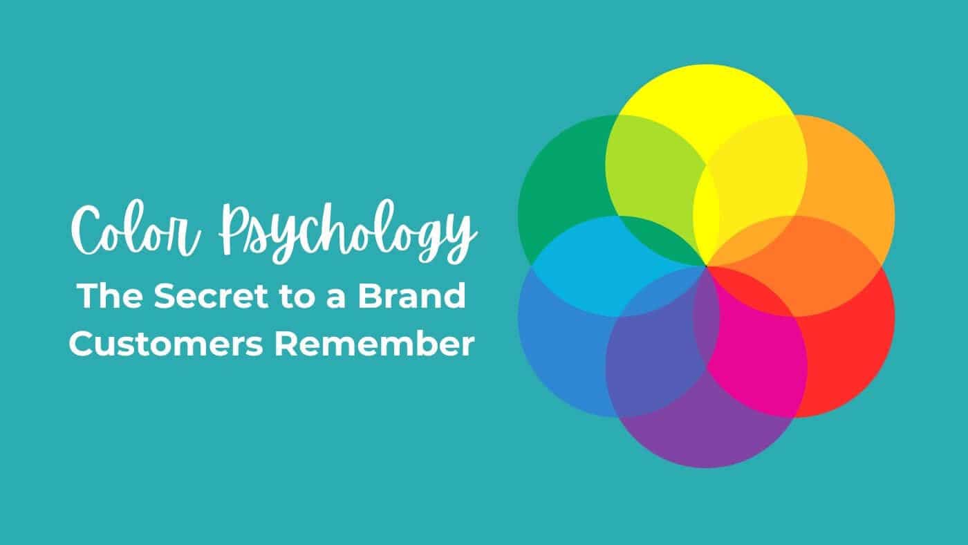
Complementary colors can create energy and contrast. Analogous colors can feel harmonious. Monochromatic palettes often look polished and cohesive. A neutral palette with one bright accent can guide the eye toward the most important information.
Readability must come first. A beautiful palette is not effective when the text disappears into the background. Color psychology still requires strong contrast for small labels, QR codes, safety information, and stickers viewed from a distance.
Match the Palette to the Brand Personality
Before choosing colors, define the personality the brand should express. Is it rugged or refined? Playful or serious? Affordable or premium? Traditional or experimental?
Color psychology is most useful when it supports those answers. A luxury candle company might choose charcoal, cream, and muted gold. A children’s activity brand might use bright primary colors. A local farm stand could use warm green, red, and natural kraft tones.
Businesses should also study their category. Matching industry expectations can help customers understand a product quickly, while breaking those expectations can make the brand memorable. The right choice depends on whether clarity or disruption is more important.
Test Colors in the Real World
A palette that looks excellent on a computer screen may change when printed. Screens emit light, while printed materials reflect it. Paper, vinyl, laminate, metallic effects, holographic patterns, and transparent materials can all alter the final appearance.
Testing is therefore an essential part of color psychology in practice. Review proofs, order samples when appropriate, and view the design under different lighting conditions. Check it from a distance and at its actual printed size.
Small businesses do not need a research department to test a palette. Create two versions of the same label or sticker, show them to people who resemble the intended customer, and ask what qualities each design communicates. Avoid asking only which version they like best. Questions about trust, energy, quality, price, and personality usually reveal more useful information. The strongest palette is the one that consistently produces a clear intended impression across many different applications.
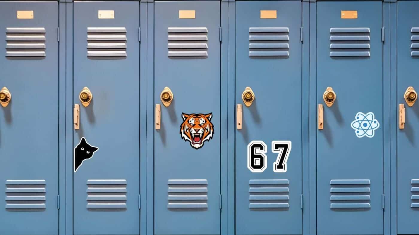
For stickers, consider how the design will look on common surfaces. A white border can help a colorful design stand out on dark objects. Clear stickers may allow the background surface to affect the colors. Holographic material can shift attention away from subtle details and toward reflective areas.
Use Stickers to Reinforce Brand Color
Custom stickers give businesses an easy way to repeat their visual identity across many customer touchpoints. They can seal tissue paper, decorate shipping boxes, label products, reward loyal customers, or turn fans into brand ambassadors.
Color psychology can guide each of those applications. A calming wellness brand may use soft blue logo stickers. A hot sauce company may choose red, orange, and black. An artist may use a highly recognizable signature palette across packaging and collectible sticker designs.
At CustomStickers.com, businesses can turn those brand colors into durable custom stickers in a wide range of shapes, sizes, and finishes. The right combination of color, material, and design can make even a simple package feel intentional.
Custom Vinyl Stickers
$30.99
Description Vinyl Stickers | Quality Vinyl Stickers By default we will die cut your vinyl stickers to the shape of your design. However, please add a note at checkout or request proofs if you would like standard shapes such as circles or… read more

Common Color Mistakes to Avoid
The first mistake is choosing colors based only on personal preference. A founder may love a certain shade, but the palette still needs to fit the audience and brand position.
The second mistake is copying a competitor too closely. Color psychology should help a company communicate clearly, not disappear into a category full of nearly identical designs.
The third mistake is using too many strong colors at once. A limited palette is often easier to recognize and reproduce. Finally, do not ignore accessibility. Important information should remain understandable for people with different forms of color vision, and meaning should never depend on color alone.
Build a Color System That Can Grow
A useful brand palette should work across more than a logo. It should remain effective on a website, business card, package, sign, social graphic, label, and sticker.
Start with a primary color that carries the main personality. Add a secondary color for variety, an accent color for emphasis, and one or two neutrals for backgrounds and text. Document the exact color values so designers and vendors can reproduce them consistently.
Color psychology provides the strategic foundation, but consistency creates recognition. When customers repeatedly see the same visual language, the brand begins to feel familiar.
Final Thoughts
Color is one of the fastest ways to communicate a mood. It can make a brand feel cheerful, dependable, natural, luxurious, rebellious, or calm before the customer has processed the message.
The most effective color psychology is not based on blindly following a chart. It comes from understanding the audience, the industry, the product, and the personality of the business. Choose colors with intention, test them in real applications, and use them consistently.
When those decisions carry through to packaging, labels, and custom stickers, color becomes more than decoration. It becomes part of the customer experience—and part of what makes the brand memorable.
FAQs
What Is Color Psychology in Branding?
Color psychology is the study of how colors influence emotions, perceptions, and behavior. In branding, businesses use these common color associations to communicate qualities such as trust, excitement, luxury, creativity, or reliability.
How Does Color Psychology Affect Customers?
Color psychology can shape the first impression a customer forms about a company or product. Although color alone does not determine a purchasing decision, it can influence whether a brand feels appropriate, recognizable, trustworthy, or appealing.
What Colors Attract Customers the Most?
There is no single color that attracts every customer. Bright colors such as red, orange, and yellow often capture attention quickly, while blue and green may create calmer or more dependable impressions. The best choice depends on the product, audience, industry, and surrounding design.
What Is the Best Color for Building Trust?
Blue is frequently associated with trust, dependability, calmness, and professionalism. This is one reason it is widely used by financial, healthcare, technology, and professional-service brands. However, color psychology works best when the chosen shade also fits the company’s personality.
How Many Colors Should a Brand Use?
Most brands benefit from a limited system consisting of one primary color, one or two secondary colors, an accent color, and a few neutrals. A focused palette is usually easier for customers to recognize and simpler to reproduce across websites, packaging, signs, labels, and stickers.