Want to make custom stickers that really stand out? Whether you’re designing stickers for a marketing campaign, branding, or just to share your art, the goal is to make them memorable and attention-grabbing. Here are some design tips to help you create stickers that don’t just look good but make a lasting impression.
1. Use Bold, High-Contrast Colors
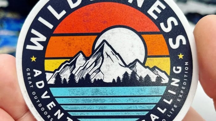
Colors are one of the first things people notice, so make them pop! Bright, high-contrast combinations are a must if you want your stickers to get noticed. Think about pairing colors like electric blue with bright yellow or a rich magenta against a jet-black background. These combinations can really make your design stand out, even from a distance.
But there’s more to color than just looking pretty. Colors can evoke different emotions and even affect how people perceive your brand. For example, warm colors like red and orange can make people feel energized, while blues and greens tend to have a calming effect. So, when choosing colors, consider what feelings you want to evoke and how they align with your brand's identity. And remember to keep your audience in mind: What will grab their attention and resonate with them?
2. Pick Fonts People Can Actually Read
When it comes to fonts, simplicity wins. We all love a good script font or a fun, quirky typeface, but let’s be honest—if people can’t read your message, it’s game over. Use bold, clean fonts that are legible, even from a distance. Classic sans-serif fonts often work well because they’re modern, crisp, and easy to read.
That doesn’t mean you can’t have fun with typography. Feel free to get creative! Just make sure the text remains readable. A pro tip is to test your design from a few feet away. If you have to squint or struggle to make out the words, it’s time to simplify. And pay attention to the balance between your text and the rest of the design. Nobody likes a cluttered sticker, so give your text some breathing room and let your design elements shine.
3. Have a Clear Focal Point
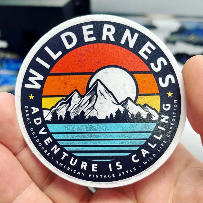
Every great design needs a hero, and your sticker is no exception. Your design should have one clear focal point, whether it’s your brand logo, a bold image, or an attention-grabbing graphic. This focal element is what will draw viewers in and make them want to take a closer look.
Think of your sticker like a billboard: People should be able to understand the main message or imagery within seconds. Once you decide on your focal point, position it strategically. You can use design techniques like contrast, scale, or framing to emphasize the focal element. If your focal point is an image, make sure it’s high quality and doesn’t get lost in the background. If it’s text, use size and color to make it pop. The idea is to create a visual hierarchy that guides the viewer’s eyes through your design.
4. Experiment with Unique Shapes
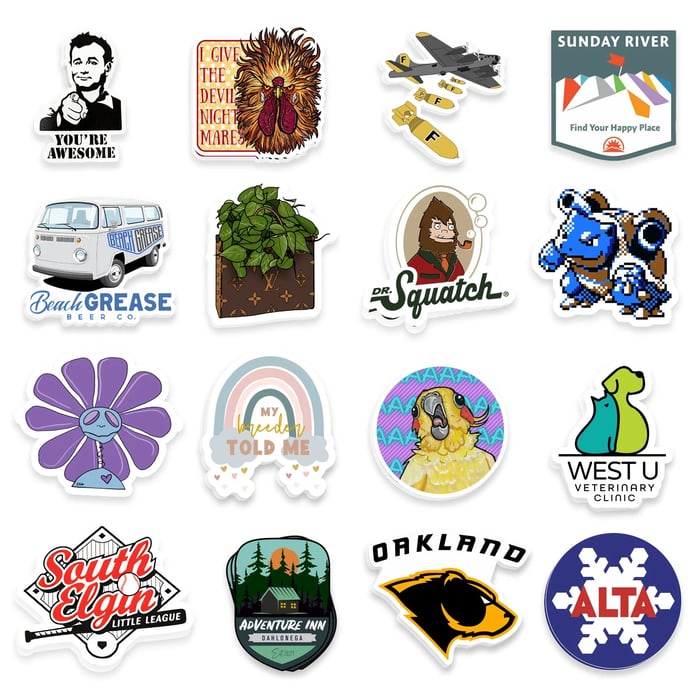
Why settle for standard circles or rectangles? One of the coolest ways to make your stickers memorable is by playing with custom shapes. Die-cut stickers—those that are cut into any shape you want—can add a playful or professional touch, depending on what you’re going for.
Imagine a coffee shop giving out stickers shaped like steaming coffee cups or a skate brand using a skateboard-shaped sticker. These unique designs immediately make a statement and can even become conversation starters. However, keep in mind that the shape should enhance your design, not distract from it. A well-thought-out shape can frame your design elements perfectly and make your stickers feel more special.
5. Don’t Forget a Call to Action
If your stickers are part of a marketing plan, a call to action (CTA) is a must. Think of it as giving your audience a gentle nudge on what to do next. A CTA doesn’t have to be complicated or pushy. It can be as simple as “Visit Us Online,” “Follow Us,” or even a memorable hashtag that encourages social engagement.
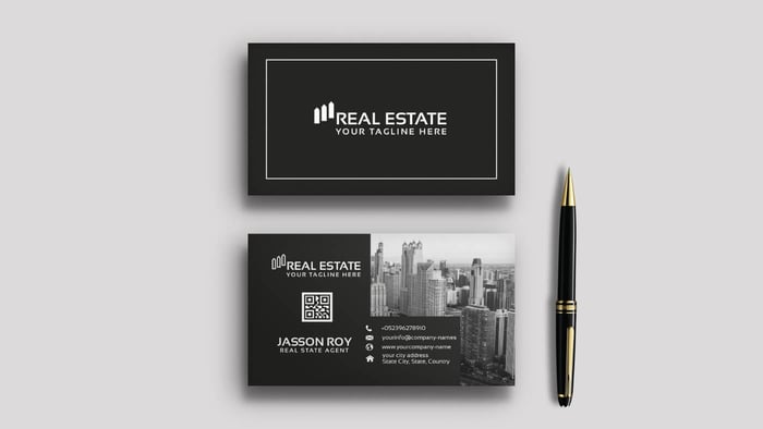
When crafting your CTA, keep it short and punchy. People are more likely to act on something simple and easy to remember. If your sticker is being handed out at events or included in product packages, consider adding a URL or QR code that leads to your website or social media pages. The goal is to make it as convenient as possible for people to engage with your brand. After all, a well-placed CTA can turn a simple sticker into a powerful marketing tool.
Bonus Tip: High-Quality Printing Makes a Difference
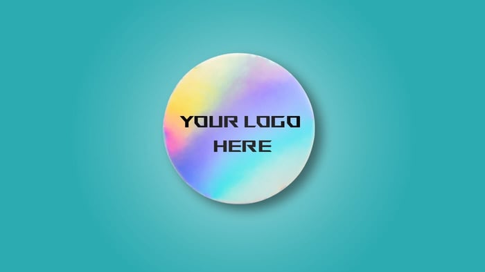
No matter how fantastic your design is, poor printing quality can ruin everything. Invest in high-quality printing to make sure your stickers look as good in real life as they do on your screen. Matte, glossy, or holographic finishes can elevate your designs even further, adding that extra touch of professionalism. Plus, durable stickers that resist fading, water damage, and scratches will keep your brand visible for longer.
--
By keeping these design tips in mind, you’ll be well on your way to creating custom stickers that not only look amazing but also leave a lasting impact. The right design can boost engagement, spark conversations, and make your brand unforgettable. Ready to bring your vision to life?
Visit our Promotions page to save on your custom stickers, labels, and business cards!

