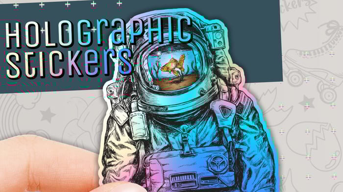

Holographic die cut stickers can make quite an impression, and they often leave people wondering how you achieved such a shiny, eye-catching effect. The iridescent sheen you get from holographic material adds a dynamic element to any sticker design, while die cutting makes it even more unique by following the exact shape of your artwork or logo. But you might wonder how to bring everything together in a way that fits your brand, holds up in real-world use, and doesn’t come off as overly flashy or chaotic. I believe the key is to focus on clarity, balance, and a bit of technical know-how. Here’s a detailed approach that can help you create a sticker that’s both functional and memorable.
Understanding Holographic Die Cut Stickers
A good place to begin is to look at your brand identity. You might ask: Does my brand lean playful or serious? Bright or minimalistic? Holographic film, by its very nature, has a prismatic or rainbow-like quality that draws attention. If your brand already uses bold colors and loves to make a statement, a sticker fully covered in holographic material could feel right. If your brand is a bit understated, consider limiting the holographic effect to a key shape or an accent area—maybe a small border or a highlight around your main text. That way, the sticker remains consistent with your broader identity rather than clashing with it. It’s also worth noting how holographic stickers might pair with your product packaging or marketing materials. Sometimes it helps to place a mockup of your sticker alongside any boxes, bags, or flyers you use, just to confirm that everything aligns visually.
Balancing Brand Identity and Holographic Flair
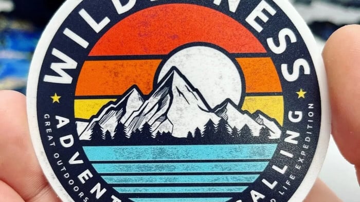
Die cutting is another layer of customization. Instead of a standard rectangle or circle, you get to pick a specific outline that follows your design. Some brands opt to die cut around their logo, while others trace a mascot or a product shape to make the sticker feel like a miniature version of their brand image. Remember that if the shape is extremely detailed, there can be issues when peeling or sticking the sticker. Tiny points, thin lines, or very tight corners might snag or tear. So there’s a balance: you want a unique silhouette, but you don’t want something so fragile that people have trouble applying it. It can help to print out a paper prototype at the actual sticker size, just to test how it feels in your hands.
Designing Around the White Ink Layer
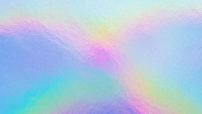
Holographic material offers a reflective surface that changes color in the light. It’s fun, but it can also wash out certain elements if you’re not careful. For instance, text placed directly onto the holographic film can appear less legible if there’s no white ink beneath it. Many printing services use a layer of white ink as a way to make certain parts of the design fully opaque. Without that white layer, the rainbow effect shines through, tinting the artwork. This can look cool—some people like that metallic, reflective version of their brand colors—but it might not be ideal for text that needs to stay sharp and clear.
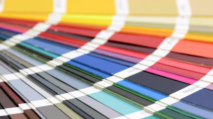
You can decide which elements should be backed by white, which ones can remain transparent, and which might blend partially to create a more subtle look. Most likely, you’ll work with separate design layers: one for the full-color artwork, one for white ink, and one for the cut line that defines the shape. Color selection also matters. A holographic base already brings a spectrum of colors into the mix, so if you pile on too many bold shades, the sticker might become visually overwhelming. Sometimes a simple approach—like black text on a holographic background—carries enough impact on its own.
Creating a Clean Cut Line
One detail that often catches newcomers by surprise is the need for a vector outline showing exactly where the sticker will be cut. Printers refer to this outline as the “cut line” or “die line.” It’s usually drawn in a vector program like Adobe Illustrator or a similar tool, and it should be a clean, closed shape with no odd overlaps. You’ll also hear about “bleed,” which is a small margin—maybe one or two millimeters—beyond the cut line. That extra margin ensures that if the cut is off by a slight fraction, you won’t see an awkward blank strip along the edge.
Some printing services can create or adjust the cut line for you if you provide layered artwork, but they may charge an extra fee for that. Either way, it’s important to review a proof before mass production to confirm that the shape, size, and design alignment are correct.
Choosing the Right Size and Shape
It’s also wise to consider how large or small your sticker should be. If it’s too big, some people won’t have a convenient surface to stick it on. If it’s too small, important details—like fine text—could be lost. You might do a little test by printing your design at different sizes on a regular home printer, cutting it out, and seeing how it looks. People often love sticking stickers on laptops, water bottles, or phone cases. If you want them to showcase your brand, pick a size that fits these common items. You could even do an informal poll among your followers or customers to see which size they’d prefer.
Selecting Quality Materials and Lamination
Another factor that goes into the final look and durability is the kind of holographic film the printer uses. Not all holographic materials are the same. Some have a more pronounced rainbow pattern, while others are more subtle or have a slightly different shimmer. Some might be thicker or more resistant to scratching. If your stickers will be handled a lot—like if people often place them on water bottles, skateboards, or other everyday items—then you might want a film that can withstand daily wear and tear. A laminate layer on top can extend the sticker’s life and protect the holographic finish from scuffs or UV fading.
If you’re unsure, you can check reviews or request a sample from the printing service to see how their holographic stickers hold up in different conditions. A cheap material might be tempting, but I don’t think it’s worth saving a few dollars if the stickers peel or fade too quickly. Your sticker is often a direct representation of your brand, so quality counts.
Distributing and Evaluating Your Stickers
When you finally receive your stickers, think about how you’ll distribute them. Will you mail them to customers? Hand them out at events? Slip them into product shipments as a bonus item? That decision can affect how you package them. If you plan to send them in envelopes, consider whether the stickers might get bent during shipping. Many folks use rigid mailers or add a piece of cardstock to keep things flat. If you’ll give them away in person at trade shows or festivals, you might want to use a sticker roll or small packs that are easy to toss on a table.
Of course, once people apply a holographic sticker, it tends to grab attention. If you place it on your company’s laptop or storefront window, it might turn a few heads. That’s where the design decisions you made really pay off. A strong brand presence, the right color contrast, and a shape that’s not confusing all come together to create an attractive piece of brand representation. And if folks see your sticker and ask, “Where’d you get that shiny sticker?” you’ve got a natural conversation starter.
Incorporating Holographic Into Your Design
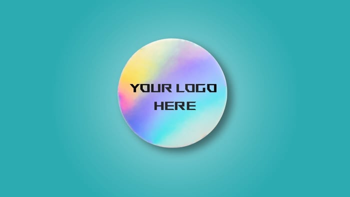
It’s also possible to get creative with negative space. Maybe your brand’s shape is the actual holographic portion, and the rest is fully opaque with white ink behind it. Or maybe certain areas are intentionally left transparent, so the film shows through in patterns or gradients. You can experiment with partial transparency if your printer supports it. That can lead to subtle color shifts in the final product, especially if you layer colored inks over the prismatic material. It can be tricky to visualize, so you might consider small test runs if your budget allows.
If you’re really concerned about brand consistency, it’s a good idea to coordinate your holographic sticker design with any brand guidelines you have. Pay attention to the exact brand colors you’re trying to match. If you want that signature blue to look somewhat close on holographic, you might need a white backing layer. Or you might embrace the shift, acknowledging that it’ll look a bit metallic. Setting realistic expectations is crucial. Holographic stickers will always look different than standard stickers under direct light. That’s part of the appeal, but it means you can’t expect a perfect Pantone match every single time.
Once your holographic die cut stickers are out in the world, keep an eye on how people respond. Are they posting photos of them online? Do they stick them on water bottles, laptops, or cars? You can learn a lot from where people choose to display your stickers and how they hold up over time. If you notice peeling or fading, that might be a sign to try a different laminate or a different printer. If you get feedback that the text is too hard to read under certain lighting, you can adjust your color placement or the use of white ink. The process can be iterative. Even if you get a design you love the first time around, you might find subtle ways to improve it in the next batch. Looking for an easy-to-peel sticker? Consider holographic peel-tab stickers.
Final Thoughts
Overall, designing holographic die cut stickers is a balance of brand consistency, practical shape, color control, and proper file setup. It sounds more complicated than a regular sticker, but the results often justify the extra steps. A holographic sticker can turn a simple promotional item into something people keep for a long time, possibly featuring it in photos or sharing it with friends. It becomes a mini conversation piece rather than just another piece of branded swag. That’s the real advantage: it creates a small but memorable experience for anyone who sees it. And in a world where everyone is trying to stand out, a little reflective sparkle might be exactly what your brand needs to catch someone’s eye and hold their interest.