Color is one of the most important aspects of design, whether it be in print, web, or any other medium. The colors you choose can affect the way people perceive your design, and can even influence their emotions and behavior. This is where color theory comes into play.
Color theory is the study of how colors interact with each other and how they can be used to create effective designs. It is an essential aspect of graphic design, as it can help designers to create harmonious and aesthetically pleasing designs. In this article, we will explore the importance of color theory in graphic design, and provide tips on how to use it to your advantage.
Understanding Color Theory
Color theory is the study of how colors interact with each other and how they can be used to create effective designs. To begin, let's quickly cover the color models that are available for designers:
- RGB color model
- CMYK color model
- HSB color model
- HSL color model
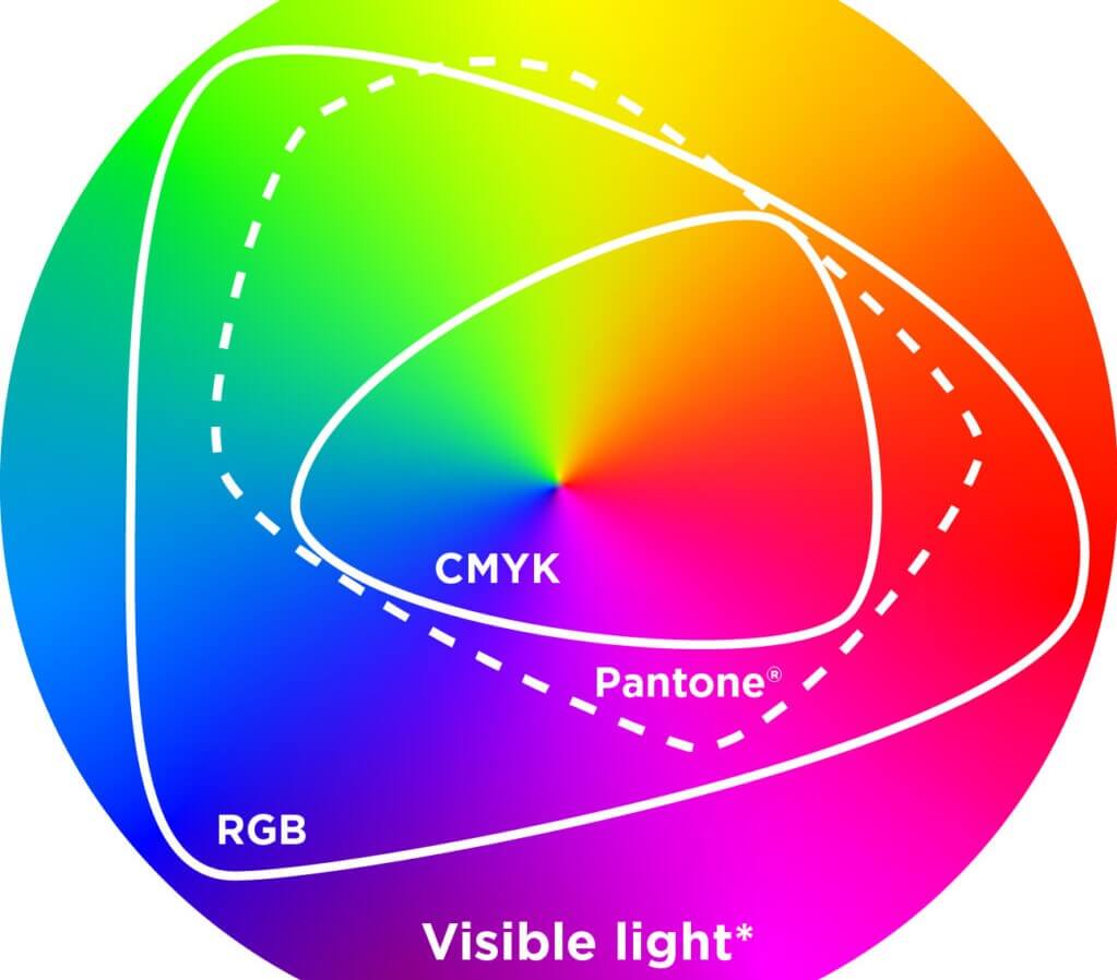
The RGB (Red Green Blue) color model is used for digital displays. It is an additive color model. It mixes red, green, and blue light to make a lot of different colors. Displays like computer monitors, TVs, and mobile phones all use this color model.
The CMYK (Cyan Magenta Yellow Black) color model is used for printing. It is a subtractive color model. It uses cyan, magenta, yellow, and black ink to make a wide range of colors. The printing industry uses this color model to make high-quality materials like brochures, flyers, and posters.
HSB (Hue Saturation Brightness) color theory is a color model that defines colors based on three values: hue, saturation, and brightness. Hue refers to the dominant wavelength of a color, while saturation refers to the intensity or purity of the color. Brightness is a measure of how light or dark a color is. In digital design programs, this color model is often used to choose and change colors.
The HSL (Hue Saturation Lightness) theory of color is similar to the HSB theory, but it uses hue, saturation, and lightness to describe colors. Lightness refers to the perceived brightness or darkness of a color. This color model is often used in web design and other digital media to make color schemes that look good and go well together.
Most printing is done in CMYK, which has a more limited pallete than RGB. However, at CustomStickers.com we use high end printers that use 10 ink colors compared to the typical 4. This allows us to print a much wider gamut. We recommend customers format their sticker designs in RGB.
The Psychology of Color
Colors can have a significant impact on the way people perceive your design. Different colors can evoke different emotions and feelings, making it important for designers to choose colors carefully. Some common associations with colors include:
- Red - passion, excitement, love
- Blue - trust, stability, intelligence
- Green - growth, nature, health
- Yellow - happiness, optimism, creativity
- Purple - luxury, spirituality, creativity
- Orange - energy, enthusiasm, warmth
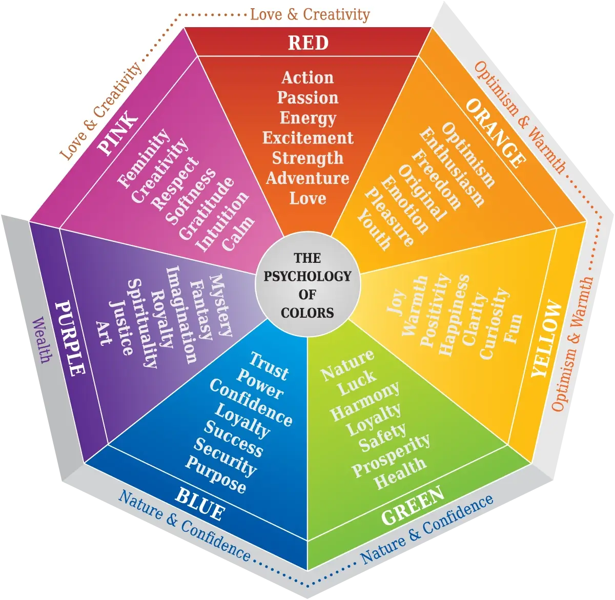
You should think about the feelings you want to evoke when developing the colors for your design. For instance, if you're making a website for a health care company, you might want to use shades of blue and green to show that the company can be trusted. If you're making a logo for a kid's toy, you might want to use fun colors like yellow and orange to make it feel fun and exciting.
Color psychology is an important part of graphic design that can have a big effect on how well your designs work. By knowing how different colors make people feel and using them strategically in your designs, you can make things that not only look great but also get your message across to the people you want to reach.
Color Harmony and Combinations
Color harmony is a basic design principle that describes how colors work together in a design to make a pleasing and balanced whole. In practice, color harmony is an important part of making designs that not only look good but also say what you want them to say.
One of the best things about color harmony is that it gives a design a sense of unity and harmony. By using colors that go well together, designers can make a composition that is visually appealing, is easy on the eyes, and draws attention to the most important parts of the design. This is especially important in print and web design, where users often have a lot of information to sort through and need to find what they want quickly and easily.
You can combine the principles of color harmony, with the psychology of color to create an appealing design that conveys a certain mood or feeling. For instance, using warm colors like red, orange, and yellow can make a room feel energetic and exciting, while using cool colors like blue, green, and purple can make a room feel calm and relaxing. By choosing the right color harmony for the message they want to send, designers can get the mood or feeling they want across to the viewer.
Color harmony can be used to create contrast and hierarchy in a design, as well as bring a design together and set a mood. By using colors that are different from each other, designers can draw attention to important parts of a design and give it depth and dimension. This is especially important in web design, where people often scan a page to find important information before reading it in more depth.
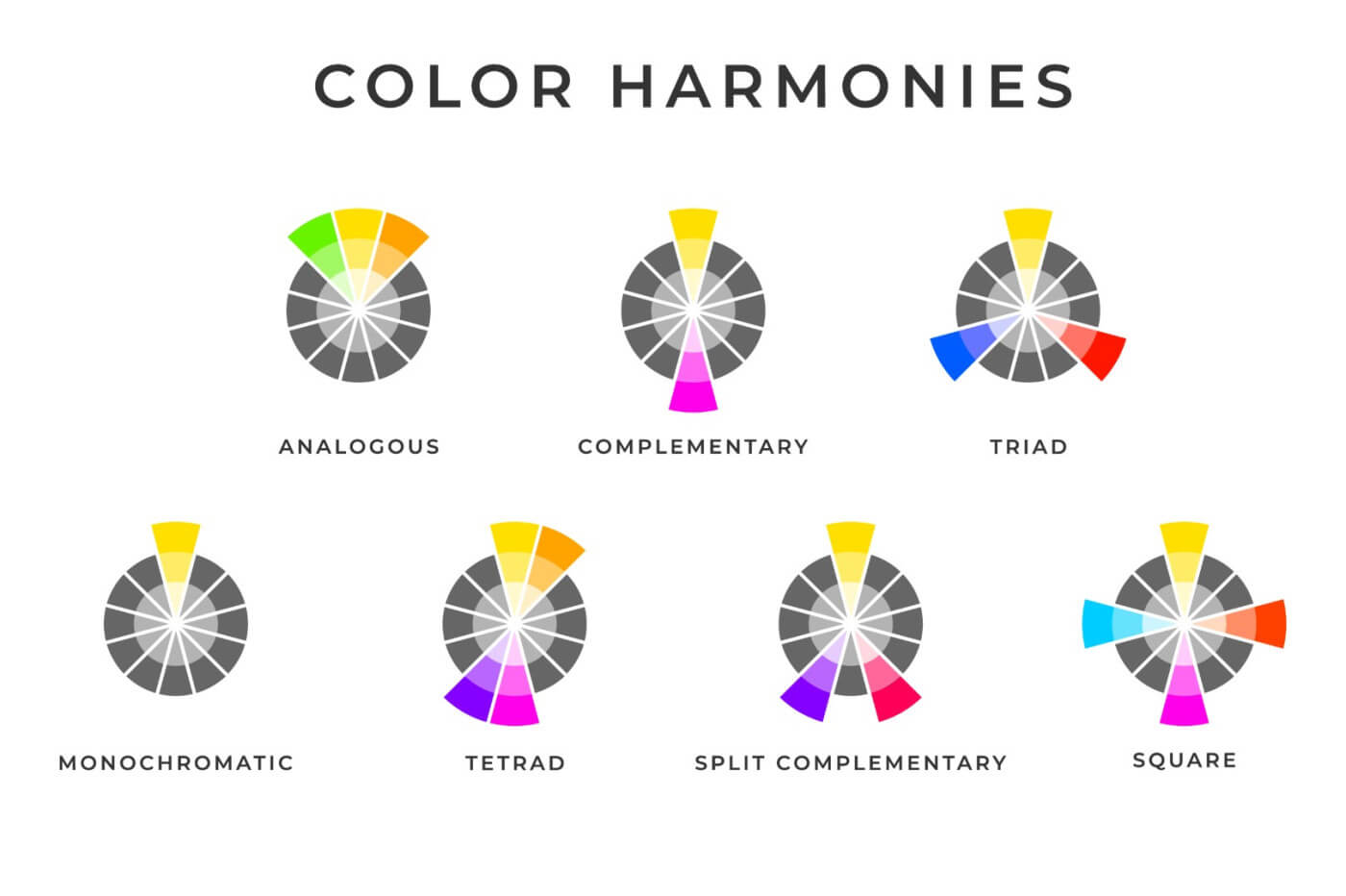
There are several different color harmonies that designers can use, including:
- Complementary colors - colors that are opposite each other on the color wheel
- Analogous colors - colors that are next to each other on the color wheel
- Triadic colors - three colors that are equally spaced on the color wheel
In addition to color harmony, designers also need to consider color combinations. Some common color combinations include:
- Monochromatic - using different shades of the same color
- Split-complementary - using one color and the two colors next to its complementary color
- Tetradic - using two complementary color pairs
By understanding color harmony and combinations, designers can create visually appealing and balanced designs.
Color in Branding
Color plays a crucial role in branding, as it can help to create a recognizable and memorable brand identity. Many successful brands use specific colors in their branding to create a consistent and cohesive look and feel. For example:
- Coca-Cola - red and white
- McDonald's - red and yellow
- Apple - white and silver
Coca-Cola, whose main colors are red and white, is one of the best-known examples of how color is used in branding. The brand's message is about happiness and joy, and the color red is often associated with passion, energy, and excitement. Red also helps the brand stand out on store shelves and in ads, which makes it easy for customers to recognize.

In the same way, McDonald's uses red and yellow in its logo to make people feel playful and excited. The use of bright colors makes the brand easy to recognize and gives it a fun vibe that kids and adults can enjoy. For better or worse, the branding has a strong draw towards children, creating a fun vibe that is easy to recognize.

Apple is another company that uses color to build its brand. It uses white and silver to show that its products are simple, elegant, and sophisticated. The brand's message is all about innovation and cutting-edge technology, so the designs are clean and simple, and the colors are neutral.

The use of color in branding can do more than make a brand's identity consistent and easy to recognize. It can also help consumers feel connected to a brand. By using colors that match the brand's personality and values, customers are more likely to feel like they belong to the brand and be loyal to it. This can be very important in industries like fashion and cosmetics where customers have strong emotional ties to the product or service.
Tips for Using Color Theory in Graphic Design
Now that we've discussed the importance of color theory in graphic design, let's look at some practical tips for using color effectively in your designs:
-
Understand your target audience: Before choosing colors for your design, it's important to consider your target audience and the emotions and associations they may have with different colors. For example, if you're designing for a children's product, you may want to use bright and playful colors.
-
Use color psychology to your advantage: As we've discussed, different colors can evoke different emotions and feelings. Use this to your advantage by choosing colors that align with the message or mood you want to convey.
-
Consider color contrast: Colors that are too similar can be difficult to distinguish and may not be effective in conveying your message. On the other hand, colors that are too contrasting can be overwhelming and distracting. Use color contrast to create a visually appealing and balanced composition.
-
Use color sparingly: While color is important in design, using too many colors can be overwhelming and distracting. Use color sparingly to draw attention to important elements and create a cohesive and visually appealing design.
Wrapping Up
Color theory is an important part of graphic design because it helps designers make designs that look good and go well together. By understanding the rules of color theory and using them to your advantage, you can make designs that are not only beautiful to look at but also have an impact and work. So, the next time you're making a design, take some time to think about how important color theory is and how it can make your designs better.
References:
-
"Color Theory for Designers: A Guide to Creating Your Own Color Schemes" by Canva: This comprehensive guide provides an overview of color theory, including the basics of color psychology, color harmony, and color schemes. It also includes practical tips for creating your own color schemes and using color effectively in your designs. Link: https://www.canva.com/colors/color-theory/
-
"The Fundamentals of Color Theory" by Creative Bloq: This article provides a detailed overview of color theory, including the basics of color models, color psychology, and color harmony. It also includes examples of different color schemes and how they can be used effectively in design. Link: https://www.creativebloq.com/inspiration/the-fundamentals-of-color-theory
-
"Color Theory: An Introduction for Designers" by Smashing Magazine: This article provides an introduction to color theory for designers, including the basics of color psychology, color harmony, and color contrast. It also includes examples of how color can be used effectively in different types of design, such as web design and print design. Link: https://www.smashingmagazine.com/2010/01/color-theory-for-designers-part-1-the-meaning-of-color/

