
Table of Contents
- TLDR
- Start With One Clear Sticker Idea
- Use Shape To Make The Sticker More Memorable
- Make Contrast And Readability A Priority
- Choose Fonts That Stay Clear At Small Sizes
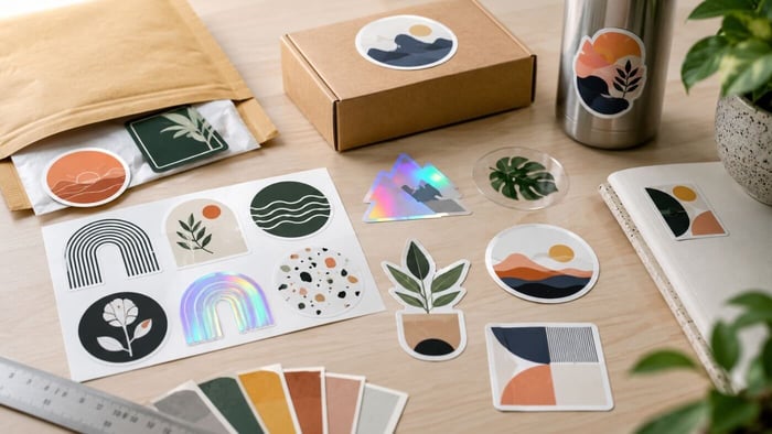
- Pick Materials And Finishes That Fit The Design
- Decide Between A Border And Full Bleed
- Design At The Size People Will Actually Use
- Prepare The Artwork For Clean Printing
- Make The Sticker Feel Worth Keeping
- Common Mistakes To Avoid
- Sticker Design Checklist
- Conclusion
- FAQs
TLDR
To design unique stickers that stand out, start with one clear idea, use a strong shape and keep the artwork readable at the final size. The best designs usually combine a simple focal point, good contrast, smart material choices and clean file setup. You do not need a complicated layout to design unique stickers. You need a sticker people understand fast and want to keep.
Start With One Clear Sticker Idea
The easiest way to design unique stickers is to begin with one main idea. That is the goal when you design unique stickers: make the idea clear before adding style. That idea might be a mascot, a short phrase, a logo badge, a product icon, a local joke or a simple illustration. Whatever it is, the rest of the design should support it.
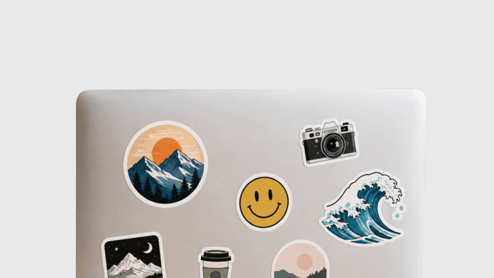
Stickers are small, and people often see them quickly. A laptop sticker, water bottle sticker or packaging sticker may only get a second of attention. If the viewer has to figure out five things at once, the design gets weaker.
Use one “hero” element. Make it big enough to read. Then use color, border, type and finish to make that idea feel finished. When you design unique stickers this way, the result usually looks more confident and less crowded.
A good test is to shrink the design to the actual printed size. If the main idea still reads clearly, you are on the right path.
Use Shape To Make The Sticker More Memorable
Shape is one of the best tools you have when you design unique stickers. A plain rectangle can work, but a custom shape often feels more intentional.
Die-cut stickers follow the outline of the artwork. A coffee cup can be cut like a cup. A dog sticker can follow the ears and tail. A brand mascot can have its own silhouette instead of sitting inside a basic square.
That edge gives the sticker personality. It also helps the sticker look custom, even when the artwork itself is simple.
Try looking at your design as a flat black shape. If the silhouette is still easy to recognize, the sticker has a strong foundation. If the shape looks confusing, simplify the outer edge or add a cleaner border.
At CustomStickers.com, custom vinyl stickers are die cut by default, and you can request standard shapes like circles or squares if that better fits the artwork.
Make Contrast And Readability A Priority
If you want to design unique stickers that people actually use, readability matters. A sticker can have great artwork and still fail if the message is too small or the colors blend together.
High contrast helps the design stand out from a distance. White on navy, black on yellow, cream on dark green or red on white can all work well because the eye can separate the main elements fast.
Low contrast can look nice on screen, but it is less forgiving in print. Pale text on a pale background may feel soft and stylish in a mockup, then become hard to read once the sticker is two or three inches wide.
Before you order, view the design at final size. Turn it to grayscale. Squint at it. If the shape, text and main art still read, your contrast is probably strong enough.
This is one of the most practical ways to design unique stickers without adding more clutter.
Choose Fonts That Stay Clear At Small Sizes
Typography can help you design unique stickers, but it can also cause problems fast.
Use one or two fonts. Keep decorative fonts for short words, names or headlines. Avoid using thin scripts or tiny all-caps text for important information. Those details can disappear when the sticker is printed small.
A good sticker font should be readable from the normal viewing distance. For a laptop sticker, that may be a couple of feet. For a product label, it may be much closer. For a bumper sticker, it may be much farther away.
If the words are the whole point of the design, give them room. Do not bury them under texture, shadows or background art. If the art is the point, keep the type secondary.
The goal is not to use the fanciest font. The goal is to make the sticker easy to understand.
Pick Materials And Finishes That Fit The Design
Materials can help you design unique stickers, but they should support the idea instead of distracting from it. If you design unique stickers for giveaways, durability and surface choice matter as much as style.
White vinyl is the safest all-around choice. It gives you strong color, clear contrast and a clean base for logos, illustrations and general sticker artwork.
Clear stickers work well on glass, jars, bottles and windows when you want the surface behind the sticker to show through.
Holographic stickers add rainbow shine and movement. They are great for artist merch, creator drops, event stickers and designs with bold shapes.
Glitter stickers are good for playful designs, party themes, seasonal campaigns and collectible stickers.
Glitter Stickers

$43.00
Description Glitter Stickers | Custom Glitter Stickers By default, glitter stickers have a glossy finish. If you are looking for a specific size/quantity combination that does not appear on this product, please reach out to our team here and we… read more
Matte laminate gives stickers a softer, modern look. Gloss laminate adds shine and can make colors feel brighter.
When you design unique stickers, match the finish to the mood of the artwork. A clean logo may look better on white vinyl with matte laminate. A bold character sticker may look great on holographic material. A packaging sticker may need clear vinyl so the container remains visible.
Decide Between A Border And Full Bleed
A white border gives the sticker breathing room. It can make characters, mascots and logos easier to see on different surfaces. It also gives die-cut stickers that familiar clean outline.
Full bleed means the artwork goes all the way to the edge. This can look polished for patterns, photos, labels and designs with a full-color background.
Both approaches can work. The choice depends on the design.
Use a border when the artwork needs separation from the surface. Use full bleed when the background is part of the design. If you design unique stickers for packaging, full bleed may look more like a label. If you design unique stickers for laptops or bottles, a border may make the sticker more versatile.
CustomStickers.com can show the border or full-bleed setup in the proof, so you can check the cutline before printing.
Design At The Size People Will Actually Use
A sticker should be designed for its real-world size. This sounds obvious, but it is one of the most common mistakes.
A two-inch product sticker cannot hold the same detail as a five-inch laptop sticker. A bumper sticker needs larger type than a sticker sheet icon. A small logo seal needs a cleaner layout than a large merch sticker.
Before printing, make a quick paper test. Print the design at actual size, cut it out roughly and place it where the sticker will go. This shows you whether the text is readable, the shape feels right and the border looks balanced.
If you want to design unique stickers that feel finished, this step is worth the few minutes. Screens can make everything look bigger and cleaner than it will feel in real life.
Prepare The Artwork For Clean Printing
Good design still needs good file setup.
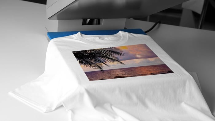
For best results, use high-resolution artwork at the final print size. A common target is 300 ppi. Vector files are ideal for logos, icons and text-based designs because they scale cleanly. High-resolution PNG and JPG files can also work well for drawings, digital art and photos.
Keep important text and art away from the cutline. Add extra artwork if you want full bleed. Avoid very thin lines unless the sticker is large enough to hold them. Make sure the art is original, licensed or approved for printing.
One helpful part of ordering through CustomStickers.com is the proofing step. The proof lets you review the shape, size and cutline before production. That is especially useful when you design unique stickers with unusual shapes or full-bleed artwork.
Make The Sticker Feel Worth Keeping
A strong sticker is not just a small ad. It should feel like something a person would choose to put on their own stuff.
That changes how you think about the design. Instead of only asking, “Does this show my logo?” ask, “Would someone actually keep this?”
A bakery might use a croissant character instead of a plain logo. A gym might use a bold badge. A coffee shop might use a phrase regulars already say. A creator might turn a popular illustration into a die-cut sticker with a strong border.
When you design unique stickers for real people, the sticker should feel like a small reward, not a flyer.
Common Mistakes To Avoid
Too much text is the biggest issue. A sticker is not a brochure.
Tiny details are another problem. Fine lines, small icons and long taglines can disappear at small sizes.
Low contrast also hurts the design. If the art blends into the background, the sticker will not stand out.
The wrong finish can create issues too. Holographic and glitter materials are fun, but busy artwork can become harder to read on reflective surfaces.
Low-resolution files are also common. A blurry file will not become sharp just because it is professionally printed.
Avoiding these mistakes is one of the simplest ways to design unique stickers that look better when they arrive.
Sticker Design Checklist
This is the practical standard when you design unique stickers for customers, fans or events.
Use this checklist before you order:
- The sticker has one main idea.
- The shape is recognizable.
- The text is readable at final size.
- The contrast is strong.
- The material fits the design.
- The border or full bleed is intentional.
- The file is high resolution.
- Important details are away from the cutline.
- The artwork is original or approved for use.
- The proof has been reviewed.
Conclusion
To design unique stickers, start simple. Choose one clear idea, make the shape strong, keep the text readable and pick a finish that supports the artwork.
A sticker does not need every effect to stand out. It needs good choices. The best designs are easy to understand, easy to remember and easy to imagine on a laptop, water bottle, notebook, package or car window.
If you want to design unique stickers for your brand, artwork or event, CustomStickers.com can help turn the file into a clean printed sticker with a proof before production.
FAQs
How Do I Design Unique Stickers For My Brand?
Start with one recognizable brand element, such as a logo, mascot, phrase or product shape. Then use a custom cut shape, strong contrast and a simple layout so the sticker feels useful instead of crowded.
What Makes A Sticker Stand Out?
A sticker stands out when the main idea is clear, the shape is memorable and the colors are easy to read. Material choices like holographic or glitter can help, but the design should work on its own first.
Should I Use A White Border?
Use a white border when you want the design to stand out on many surfaces. Use full bleed when the background or color should run all the way to the edge.
What Resolution Should Sticker Artwork Be?
Aim for 300 ppi at the final print size. Vector artwork is best for logos and text, while high-resolution PNG or JPG files can work well for illustrations and photos.
Can CustomStickers.com Help With Sticker Artwork?
Yes. CustomStickers.com provides proofs and can help review the cutline, size and basic setup before your stickers go into production.