Table of Contents
- TLDR
- Start With What You Want to Be Known For
- Build a Small Visual Identity
- Use Consistent Colors Without Limiting Your Art
- Make Your Product Photography Consistent
- Write Product Listings Like a Reliable Business
- Choose a Focused Product Range
- Make the Packaging Feel Connected to the Art
- Make Every Insert Earn Its Place
- Create a Professional Online Home
- Present Yourself Consistently at Markets and Events
- Price With the Whole Business in Mind
- Use Social Media as Proof of the Brand
- Develop a Simple Brand Checklist
- Common Mistakes That Make an Art Brand Look Less Professional
- Professional Does Not Mean Impersonal
- FAQs
TLDR
Define what your work is known for before choosing colors, fonts, and packaging.
Use the same logo, visual style, voice, and product presentation across every customer touchpoint.
Invest in clear photography and accurate product descriptions before adding more products.
Create packaging that protects the order and feels connected to the artwork.
Start with a simple artist branding system you can repeat consistently.
A professional art brand does not need to look like a large company. It needs to feel intentional. Customers should be able to move from your social profile to your online shop, open an order, and recognize the same artist at every step.
That is the purpose of artist branding. It gives your work a consistent frame without making every painting, print, or product look identical. Good artist branding helps people understand what you make, remember where they saw it, and feel confident buying from you.
The goal is not to hide your personality behind corporate design. It is to remove the small signs of uncertainty that can make a talented artist look unprepared.
Start With What You Want to Be Known For
Before choosing a logo or ordering packaging, write one sentence that explains your work. Strong artist branding begins with a clear idea of what the audience should remember.
For example:
I create bright botanical illustrations inspired by desert plants.
I paint moody landscapes based on quiet places in the American West.
I make playful character art for people who enjoy fantasy and tabletop games.
I design geometric prints for modern homes and workspaces.
This sentence is not necessarily your public slogan. It is a filter for artist branding decisions. If a font, photo style, product, or social post does not fit the direction, you have a reason to leave it out.
Clear artist branding makes the store easier to understand and the work easier to remember.
You can still experiment. Your artist branding simply gives the main body of work a recognizable center.
Build a Small Visual Identity
You do not need a complicated brand manual. A small artist branding guide is often enough to keep daily decisions consistent. Begin with a basic system that includes:
A primary logo or wordmark
A simplified logo or initials
Two or three main colors
One headline font
One body font
A consistent photo background or editing style
Basic rules for spacing and logo use
Consistency across colors, typography, imagery, and other customer touchpoints is a central part of brand identity. It helps separate deliberate artist branding from a collection of unrelated design choices.
Keep the logo readable. Highly detailed illustrations often lose clarity on small stickers, profile photos, package seals, and business cards. A simple wordmark or monogram may serve your artist branding better than a miniature version of your most complex artwork.
Save the logo in several formats. Keep an SVG, EPS, AI, or vector PDF for professional printing and scaling. Also save transparent PNG versions for your website, email, and social media.
Use Consistent Colors Without Limiting Your Art
Artists often resist brand colors because their work already contains a broad palette. That is reasonable. Your brand colors do not have to control the artwork.
Think of them as the gallery walls rather than the paintings.
Use color to support artist branding without limiting the palette inside the artwork. Choose colors for:
Website buttons
Shop banners
Packaging cards
Social templates
Market signage
Email headers
Price lists
Logo applications
Neutral colors are often useful because they do not compete with the work. But a distinctive accent color can help artist branding feel memorable. The same muted green, warm red, or deep blue can appear on your website, package inserts, labels, and event display without being added to every piece of art.
Write down the exact color values. Using a slightly different blue every time may not seem important, but those small shifts can make artist branding feel less controlled.
Make Your Product Photography Consistent
Professional-looking products need clear, believable photographs. Consistent photography is one of the strongest artist branding signals in an online shop. Expensive equipment is less important than consistency.
Use:
Soft, even light
A clean background
Accurate color
A stable camera position
Straight horizons and vertical lines
Similar crops across product listings
Detail photos that show texture and finish
One image that communicates scale
Product photography supports both online sales and broader promotion because it shows the item itself while also supplying images for websites, advertisements, and other marketing materials.
Create a repeatable setup rather than inventing a new scene for every item. For example, photograph every print against the same warm wall, every sticker on the same neutral desk, and every original painting in both a straight-on view and a styled room view.
Artist branding becomes stronger when a customer can scroll through your shop and see that the products belong together.
Avoid filters that change the color of the art. A warm, dramatic edit may look attractive on social media but cause disappointment when the actual print arrives with different tones.
Write Product Listings Like a Reliable Business
A professional listing answers obvious questions before the customer has to ask. This is where artist branding becomes practical rather than merely visual.
Include:
Product dimensions
Materials
Finish
What is included
Whether a frame or prop is included
Packaging method
Processing time
Care instructions
Color variation notes
Shipping details
Return or replacement information
Do not rely on phrases such as “high quality” without explaining what that means. Name the paper, material, finish, printing method, or construction detail that supports the claim.
Artist branding includes language as well as visuals. Decide how you want to sound and keep that voice consistent. You may be warm and conversational, calm and minimal, or playful and informal. The tone should fit the work and remain easy to understand.
Proofread every product title, image, option, and description. A single typo will not ruin a shop, but repeated errors, confusing size choices, and missing information can make buyers hesitate.
Choose a Focused Product Range
A professional store does not need dozens of product types. It needs a few products that make sense together. A focused catalog strengthens artist branding by making the shop easier to understand.
A practical collection might include:
Original artwork
Open-edition prints
Limited signed prints
Individual stickers
Sticker packs
Sticker sheets
Greeting cards
One commission option
Each product should have a role. A sticker gives new customers a low-cost entry point. A print becomes the core purchase. An original or commission provides a higher-value option.
This structure makes artist branding easier because you are not trying to design packaging, photography, pricing, and listings for 20 unrelated formats.
Artists who want to create a small physical product can turn illustrations into custom artwork stickers. Artists upload their artwork and review how the finished sticker will be printed and cut before production.
For collections with several related designs, custom sticker sheets can present multiple pieces as one coordinated product. That often supports artist branding better than selling every small illustration separately.
Make the Packaging Feel Connected to the Art
Packaging should protect the product first. After that, artist branding should continue through the same visual language customers saw in your shop.
You do not need a custom-printed box for every order. A simple artist branding system might use:
A plain rigid mailer
Tissue paper in one brand color
A logo sticker
A thank-you card
A care or display instruction card
A small promotional sticker
Consistent handwriting or printed labels
The package should feel considered, not overfilled. Too many ribbons, cards, samples, confetti pieces, and decorative layers can raise costs while making the order harder to open and recycle.
A single packaging sticker can close tissue paper, brand a shipping box, or add a thank-you message without replacing all of your existing packaging. That makes it a flexible tool for artist branding, especially when you are still testing order volume.
Use packaging materials that suit the work. Prints need rigid protection. Stickers need protection from bending and moisture. Original paintings may need corner guards, glassine, or a custom box.
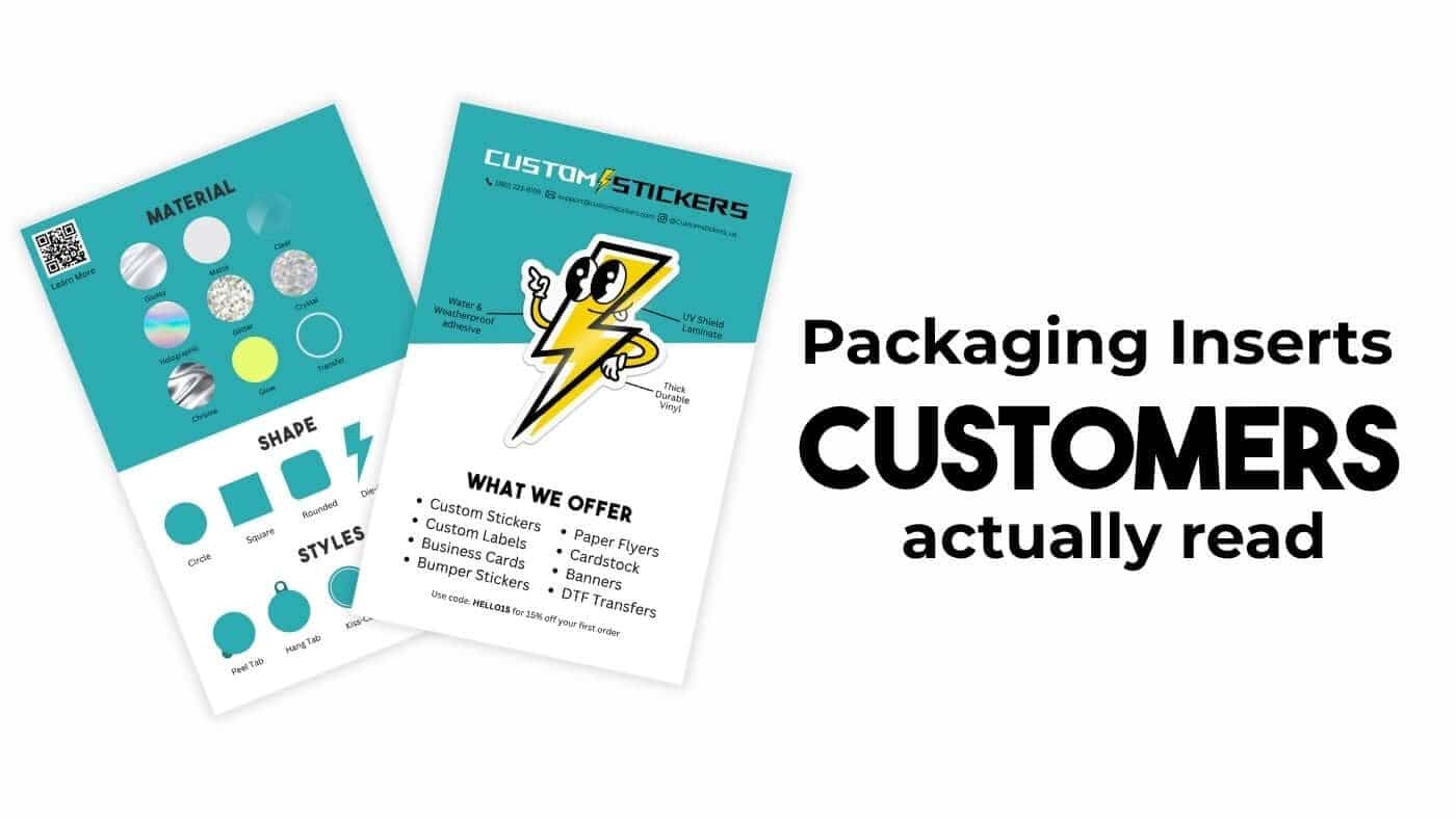
Make Every Insert Earn Its Place
Package inserts should do one clear job.
Useful options include:
Thanking the customer
Explaining how to care for the artwork
Sharing the story behind a collection
Providing a future-use discount
Asking for a review
Directing buyers to your shop or mailing list
Keep the layout clean and the message short. The insert is part of artist branding, but it should not become a tiny brochure filled with every link, product, and announcement you have.
A business-card format can work well because it is easy to store and inexpensive to include. Artists who want the card itself to become a useful takeaway can consider business card stickers, which can combine contact information with a removable branded element.
Include your shop address or a short QR code destination, but test it before printing. Avoid making customers search through several social accounts to find the place where they can actually purchase.
Create a Professional Online Home
Social media is useful for discovery, but it should not be the only place your brand exists. Strong artist branding needs a dependable destination where customers can learn, shop, and contact you.
At minimum, create one dependable page that includes:
Your name or studio name
A concise explanation of your work
A portfolio or product collection
Clear prices where appropriate
A way to purchase or inquire
Shipping and return information
Contact details
Links to active social accounts
The website should reflect the same artist branding used in your photography and packaging. Reuse the same fonts, colors, logo versions, and tone.
Do not let design get in the way of shopping. Large animations, hidden menus, low-contrast text, and complicated category names may feel artistic but can make the site harder to use.
A customer should be able to answer three questions quickly: What does this artist make? How much does it cost? How do I buy it?
Present Yourself Consistently at Markets and Events
Your physical display should look like the same business customers see online. Bring the same artist branding into signs, labels, bags, and printed takeaways.
Bring:
A clear sign with your name
Visible prices
Consistent product labels
Simple display materials
Business cards or takeaways
Bags or sleeves for purchases
A payment method that is ready to use
A QR code sticker that leads to your shop
-
QR Code Stickers
$11.99
Description Custom QR Code Stickers | Promotional Stickers Custom QR code stickers are perfect for handing out at events. Print them for business cards, wedding registries, and so much more. Instantly link friends, family, and potential customers to your website, Venmo, and… read more


Artist branding at a market does not require matching furniture or an elaborate booth. It requires organization.
Use height to make products visible. Group related work together. Remove empty boxes, food, personal bags, and packing clutter from the customer-facing area. Keep replacement inventory close enough to restock without turning the table into storage.
The same logo sticker used on shipped orders can also seal market bags. Repeating a few elements is usually more effective than creating a separate visual identity for every sales channel.
Price With the Whole Business in Mind
Low pricing does not automatically make an emerging artist look approachable. Sometimes it makes the work feel temporary or raises questions about materials and durability. Artist branding loses credibility when prices feel improvised or inconsistent.
Calculate:
Production cost
Packaging
Platform and payment fees
Shipping supplies
Damaged or lost inventory
Photography and listing time
Design and production labor
Discounts
Taxes where applicable
Profit needed to continue
Professional artist branding is supported by clear, stable pricing. Avoid changing prices randomly between your website, social messages, and market table.
Create a consistent policy for commissions, wholesale orders, bundles, and discounts. You can revise prices as costs and demand change, but customers should not feel that the final number depends on how confidently they ask.
Use Social Media as Proof of the Brand
Social media can make your business feel credible when it shows a clear pattern of real work.
Share a mixture of:
Finished artwork
Product photos
Studio process
Packaging orders
Market displays
New releases
Customer photos with permission
Short explanations of materials or techniques
Artist branding does not mean every post needs the same template. It means the overall account should feel connected.
Use a recognizable profile image, keep your bio current, and make the purchase link easy to find. Archive outdated sales information when it could confuse customers.
And show evidence that the business is active. A shop with beautiful products but no recent posts, unavailable links, or unanswered comments may look abandoned.
Develop a Simple Brand Checklist
Before publishing a product or sending an order, check the following:
Is the logo current and used correctly?
Do the colors and fonts match the rest of the shop?
Are the photos clear and color-accurate?
Is the product size easy to understand?
Does the description answer likely questions?
Is the price consistent across sales channels?
Does the package protect the product?
Does the insert have one clear purpose?
Are all links and QR codes working?
Does this item fit the larger artist branding system?
A checklist reduces last-minute decisions. It also makes your presentation more consistent as the number of products grows.
Common Mistakes That Make an Art Brand Look Less Professional
Changing the Visual Style Constantly
Frequent redesigns make recognition difficult. Give a good artist branding system time to work before replacing it.
Using Low-Resolution Logos
A logo copied from a social profile may look blurry in print. Keep original vector and high-resolution files.
Showing Only Digital Mockups
Mockups are useful, but customers also need photographs of the real product.
Hiding Prices
“Message for price” creates friction for standard products. List prices unless the project genuinely requires a custom quote.
Overdesigning the Packaging
More material does not always create more value. Protect the order and use a few consistent details.
Copying Another Artist Too Closely
References are normal, but your artist branding should reflect your own work, audience, and way of communicating.
Waiting for Everything to Be Perfect
A basic, consistent system is better than a perfect system that never launches. Begin with the essential pieces and improve them as the business grows.
Professional Does Not Mean Impersonal
The best artist branding makes the work easier to recognize and buy without removing the artist from the experience. Professional artist branding creates structure while leaving room for personality and experimentation.
Choose a clear direction. Repeat a small set of visual elements. Photograph the real products carefully. Explain what customers will receive. Protect each order and make the packaging feel related to the art inside.
You do not need to look like a large company. You need to look like you care about the details and can deliver what you promise.
That is what makes an art brand feel professional.
FAQs
Do Artists Need a Logo?
Not every artist needs a complex symbol. A clear, well-designed name or signature can be enough. The important part is using it consistently and keeping it readable.
How Many Brand Colors Should an Artist Use?
Two or three main colors are enough for many small art businesses. The artwork can contain a wider palette while the surrounding artist branding remains consistent.
What Should an Artist Include in Packaging?
Start with protective materials, a thank-you note, contact information, and any necessary care instructions. Add decorative elements only when they support the experience.
How Can an Artist Look Professional on a Small Budget?
Focus on clean photography, clear descriptions, consistent fonts and colors, reliable communication, and simple packaging. Those details matter more than expensive custom boxes.