Table of Contents
- TLDR
- Start With a Simple Style Guide
- What a Style Guide Should Include
- Define Your Brand Basics First
- Set Clear Logo Rules
- Choose a Color Palette You Can Actually Use
- Pick Fonts With a Clear Purpose
- Write Down Your Brand Voice
- Add Imagery and Graphic Elements
- Include Packaging, Sticker, and Label Rules
- Create a One-Page Version First
- Beginner Mistakes to Avoid
- Simple Style Guide Template
- Final Thoughts
- FAQs
TLDR
A style guide is a simple reference document that explains how your brand should look and sound.
Start with logo rules, colors, fonts, voice, imagery, packaging notes, and a few real examples. You do not need a large brand book to get started.
The goal is consistency. When your website, packaging, stickers, emails, and product labels feel connected, your brand becomes easier to recognize.
A good style guide saves time because designers, printers, freelancers, and team members have clear rules to follow.
Start With a Simple Style Guide
A style guide for beginners should be practical, not intimidating.
It should answer one basic question: “How should our brand look and sound when someone else is creating something for us?”
That person might be a designer making a flyer, a printer setting up packaging stickers, a team member posting on social media, or you trying to make a quick sale graphic without accidentally using six fonts. It happens.
A style guide collects your visual identity and brand voice rules in one place. It helps keep your logo, color palette, typography, photo style, packaging, and marketing materials consistent. For a small business, that consistency matters because customers often see your brand in small pieces before they buy.
They may notice your logo on a shipping box. Then they see a product label. Then an Instagram post. Then an email. If those pieces look connected, the brand feels more polished. If each piece looks like it came from a different business, the customer has to work harder to remember you.
Your first version can be short. For most beginners, a one-page style guide is enough. You can add more detail as your business grows.
What a Style Guide Should Include
A style guide is a reference document for your brand elements.
At minimum, include:
Logo versions and logo usage rules
Brand colors with exact color codes
Brand fonts and when to use each one
Voice and tone guidelines
Photography, illustration, or icon style
Packaging and print design notes
Examples of approved and unapproved use
Think of it as a small instruction manual for your brand.
It is not the same thing as a logo file. A logo is one piece of the brand. The guide explains how that logo should be used with everything else.
For example, your guide might say:
“Use the full-color logo on white or cream backgrounds. Use the one-color black logo when printing on kraft paper. Do not stretch the logo, change the colors, or place it on busy photos.”
That direction may feel obvious when the brand lives in your head. But it is not obvious to everyone else. A style guide gets those decisions into a format other people can follow.
Define Your Brand Basics First
Before choosing colors and fonts, write down the basic idea of the brand. This gives your style guide a clear foundation.
Start with four prompts:
What do we sell or offer?
Who is this for?
How should customers feel when they interact with us?
What should customers remember about us?
Keep the answers short.
Example:
Brand description: We sell small-batch hot sauce with bright flavor, clean ingredients, and playful packaging.
Audience: Home cooks, gift buyers, and people who like flavorful pantry staples.
Customer feeling: Excited, curious, and confident enough to try something new.
What to remember: Bold flavor without gimmicky branding.
This gives your design choices a job. Your logo, colors, typography, stickers, labels, and product photography should all support the same idea.
If your brand is calm and natural, neon colors and aggressive fonts probably do not fit. If your brand is playful and loud, an overly plain black-and-white system may feel too quiet. Neither direction is automatically wrong. The right choice depends on the brand you are building.
Set Clear Logo Rules
Your logo is usually the most visible part of your visual identity, so it needs a few basic rules.
Include these logo files in your guide:
Primary logo
Secondary logo or stacked version
Icon, mark, or simplified logo
One-color version
Reversed version for dark backgrounds
Then explain how to use them in the style guide.
At minimum, include rules for clear space, minimum size, approved backgrounds, and what not to do. The “what not to do” section is useful because it prevents common problems before they happen.
Common logo mistakes include stretching the logo, changing the colors, adding effects, placing the logo on a busy photo, using an old file, cropping part of the logo, or making it too small to read.
For printed materials, think about how the logo works at small sizes. A detailed logo may look fine on a website header but become hard to read on a tiny product label or a small round sticker. If your logo has thin lines, small text, or detailed artwork, create a simplified version for small uses.
Choose a Color Palette You Can Actually Use
A good beginner color palette is usually simple.
Start with:
One primary brand color
One or two secondary colors
One light neutral
One dark neutral
Optional accent color
Write down the color codes for each color. For digital use, include HEX codes. For print, include CMYK or Pantone information if you have it. If you do not have print color values yet, add them later when you work with a designer or printer.
Also explain how the colors should be used in the style guide.
Example:
Primary green: Use for logo accents, buttons, and key packaging details.
Cream: Use as the main background color.
Dark charcoal: Use for body text.
Orange: Use sparingly for sale callouts or flavor badges.
This matters because having colors is not the same as knowing how to use them. Without usage rules, every design becomes a guessing game.
Keep contrast in mind too. Light text on a light background may look soft, but it can be hard to read. The same goes for small text on labels, stickers, and packaging. Readability should win.
Pick Fonts With a Clear Purpose
Typography can make a brand feel polished quickly. It can also make things feel messy quickly.
For a beginner style guide, choose two fonts:
A heading font
A body font
You can add an accent font, but only if you have a clear reason. Too many fonts make the brand harder to manage.
Your style guide typography section should explain which font to use for headlines, body copy, buttons, labels, and small text. It should also explain what fonts not to use.
Example:
Headlines: Use Montserrat Bold for product names and major headings.
Body copy: Use Open Sans Regular for descriptions, emails, and website text.
Small print: Use Open Sans Medium for ingredients, care notes, and label details.
Avoid: Script fonts for body copy or small product details.
This is especially important for printed materials. A font that looks nice in a large social post may not work on a 2-inch label. For small text, choose clarity over personality.
Write Down Your Brand Voice
Your brand voice is how your business sounds. Your tone is how that voice changes depending on the situation.
For example, your voice may be friendly and practical. Your tone might be cheerful on a product launch post, calm in a customer support email, and appreciative in a thank-you card.
A simple voice section can include:
Three to five words that describe your brand voice
Three to five words that do not describe your brand voice
Phrases you use often
Phrases you avoid
Example sentences
Here is a simple format:
We sound: helpful, direct, warm, practical.
We do not sound: pushy, sarcastic, overly formal, childish.
Use: “Here’s what to expect.”
Avoid: “Act now before it’s too late.”
You can also include a few sample captions, email lines, or packaging messages. This makes the style guide easier to use because people can copy the rhythm, not just read the rule.
Add Imagery and Graphic Elements
Visual consistency goes beyond the logo.
Your style guide should explain what kind of images fit your brand. This includes photography, illustrations, icons, patterns, textures, and background shapes.
For product brands, this section is especially helpful because visuals show up everywhere: websites, product photos, packaging, inserts, social media, stickers, booth signs, and email graphics.
For a handmade soap brand, the imagery rules might say:
Use natural light, clean backgrounds, close-up texture shots, and soft neutral props. Avoid heavy filters, cluttered bathroom scenes, overly dark photos, and stock images that feel generic.
For a skate shop, the rules would be different. It might use action photos, street textures, bold crops, and energetic layouts. Again, the goal is not to copy a trend. The goal is to make repeatable choices.
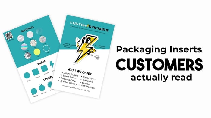
Include Packaging, Sticker, and Label Rules
A style guide becomes much more useful when it covers real customer touchpoints.
For small businesses, those often include product labels, shipping boxes, mailers, thank-you cards, logo stickers, booth signage, QR code stickers, care instruction cards, and loyalty cards.
This is where your brand moves from screen to real life.
If you use branded packaging, write down where your logo should go, what colors are approved, how large the logo should be, and what information needs to stay readable. If you use stickers as part of your packaging or marketing, decide which designs are evergreen and which are seasonal.
For example, a simple packaging rule might be:
Use the small round logo sticker to seal tissue paper. Use the rectangular product label on jars. Use the full-color thank-you sticker only inside customer orders.
If you are printing branded giveaways, logo seals, or packaging extras, custom vinyl stickers are a flexible option because they can be made in different shapes and sizes. For product packaging, custom labels may be a better fit when you need labels on rolls or sheets for repeated application.
It is also smart to include basic print notes in your style guide. Add preferred logo file types, minimum readable text size, approved sticker or label shapes, finish preferences, background color rules, QR code placement rules, and required product information.
This section does not need to be technical. It just needs to prevent avoidable confusion.
Custom Vinyl Stickers

$28.99
Description Vinyl Stickers | Quality Vinyl Stickers By default we will die cut your vinyl stickers to the shape of your design. However, please add a note at checkout or request proofs if you would like standard shapes such as circles or… read more
Create a One-Page Version First
A one-page style guide is often the best place to start.
Use this simple structure:
Brand name and tagline
Short brand description
Audience
Brand voice
Logo files
Color palette
Fonts
Photo style
Packaging and print notes
Three do’s and three don’ts
That is enough for a beginner style guide to guide most small projects.
The key is to make the guide easy to find. Save it somewhere obvious. Share it with anyone who creates content, packaging, social posts, labels, stickers, ads, or printed materials for your business.
A document buried in a random folder is not very useful. A simple guide your team actually uses is much better than a polished document nobody opens.
Beginner Mistakes to Avoid
The biggest mistake is making the style guide too complicated too soon.
A beginner style guide should help people make faster decisions. It should not make every small design choice feel like a legal review.
Common mistakes include choosing too many colors, using too many fonts, forgetting small-size use, only showing pretty examples, ignoring brand voice, writing vague rules, and never updating the guide.
“Make it clean” is not enough. Show what clean means for your brand. Add a screenshot, mockup, label photo, or short example so the rule is easy to follow.
Simple Style Guide Template
Use this as a starting point:
Brand Name:
[Your business name]
Tagline:
[Your tagline, if you have one]
Brand Description:
[One to two sentences about what you sell and who it is for]
Audience:
[Who you are trying to reach]
Brand Voice:
We sound: [word], [word], [word]
We do not sound: [word], [word], [word]
Logo Rules:
Use: [primary logo, icon, one-color version]
Do not: [stretch, recolor, crop, add effects]
Colors:
Primary color: [name and HEX code]
Secondary color: [name and HEX code]
Neutral color: [name and HEX code]
Accent color: [name and HEX code]
Fonts:
Heading font: [font name]
Body font: [font name]
Imagery:
Use: [photo or illustration style]
Avoid: [styles that do not fit]
Packaging and Print:
Sticker style: [shape, finish, use case]
Label style: [shape, material, use case]
Notes: [QR codes, small text, color rules, finish preferences]
Final Thoughts
A style guide does not have to be fancy to be useful.
For beginners, the best guide is clear, short, and practical. It should explain how your logo, colors, fonts, voice, images, packaging, stickers, and labels work together. That is what makes the brand easier to recognize.
Start with one page. Add examples as you create more materials. Update the guide when something changes.
Over time, this small document becomes one of the most useful tools in your business. It helps your brand stay consistent even when you are busy, growing, or handing work to someone new.
Review the guide whenever you update your logo, website, packaging, product line, photography, or messaging. For many small businesses, a quick review once or twice a year is enough.
FAQs
How long should a beginner style guide be?
A beginner style guide can be one to five pages. Start with the basics: logo, colors, fonts, voice, imagery, and a few examples. You can expand it as your business adds more products, packaging, and marketing channels.
Do I need a designer to create one?
No, you can create a basic guide yourself. A designer can help refine the system, especially if you need custom logo files, typography rules, or packaging layouts. But a clear beginner guide is better than having no guide at all.
What is the difference between brand identity and brand guidelines?
Brand identity is the overall look, sound, and feel of your business. Brand guidelines explain how to use that identity consistently.
Should I include stickers and labels?
Yes, if stickers, labels, packaging, or printed materials are part of your customer experience. Include basic rules for logo placement, colors, finish preferences, size, readability, and when to use each type of printed piece.