
Table of Contents
- TL;DR
- What White Ink Does on Clear Stickers
- White Underbase: The Most Common Use for White Ink
- Use White Ink as Part of the Actual Design
- Decide What Should Be Opaque and What Should Stay Clear
- Think About the Surface Before You Design
- When You Might Skip the White Underbase
- Clear Stickers vs. White Vinyl Stickers
- How to Design Better Clear Stickers
- How to Request White Ink From CustomStickers
- How to Prepare Artwork for White Ink
- What to Check on Your Proof
- Common White Ink Mistakes
- Where White Ink Works Especially Well
- A Simple White Ink Checklist
- FAQs
TL;DR
White ink gives clear stickers opacity where you need it while leaving the rest of the material transparent.
Use a white underbase behind color when you want logos, text, or artwork to stay bright on glass, bottles, dark packaging, or colored surfaces.
Leave selected areas without white ink when you want the surface underneath to show through.
If your artwork contains visible white text or graphics, those areas need actual white ink. White on a screen does not automatically mean white will print.
When ordering from CustomStickers, leave a note at checkout explaining where you want white ink used. We can add it during prepress before you approve the proof.
Clear stickers look simple because the material seems to disappear once it is applied. But that transparency changes how printed color behaves. A logo that looks bright on a white artboard can become muted on clear vinyl, and white areas can disappear completely if they are not intentionally printed.
That is where white ink comes in. Used well, white ink lets clear stickers keep their transparent look while making selected parts of the artwork solid, readable, and much closer to the color you expected. The key is deciding what should be opaque, what should print white, and what should stay transparent.
What White Ink Does on Clear Stickers
Most standard full-color printing uses cyan, magenta, yellow, and black inks. Those colors normally rely on a white surface underneath them. On white vinyl, the material itself provides that base.
Clear vinyl does not.
When color is printed directly onto transparent material without a white base, some light passes through the ink. The surface underneath can then influence what you see. That can be useful when you want a translucent effect, but it can also make pale colors, fine details, and brand colors look weaker than expected.
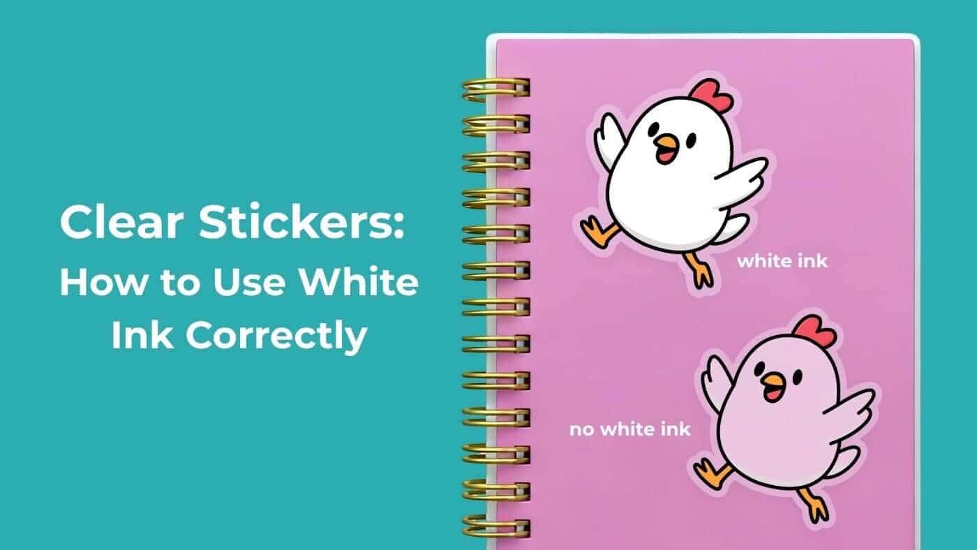
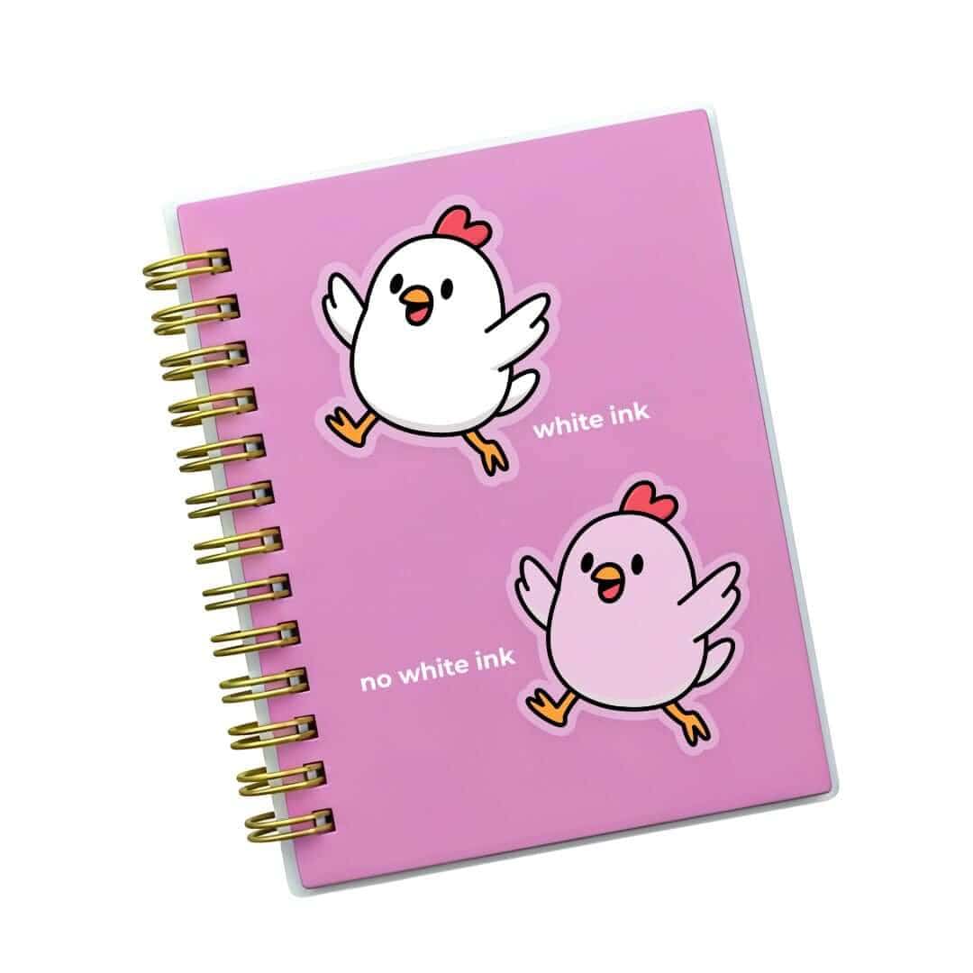
White ink gives clear stickers a controlled opaque layer. We can put white underneath colored artwork, use white as a visible design color, or leave selected areas completely transparent.
For many designs, the best result is a mix of all three.
White Underbase: The Most Common Use for White Ink
A white underbase is a layer of white ink printed beneath selected colored areas.
Think of it as giving the colored parts of clear stickers their own small white background without turning the whole sticker into white vinyl. The white layer blocks the color of the application surface from showing through as strongly.
Imagine a red and navy logo on a glass bottle. Without white behind the logo, both colors may look more translucent and can change depending on what is behind the glass. With a white underbase, the logo becomes more opaque and more consistent.
A white underbase is especially useful for:
Brand logos
Product names
Small text
Light colors
Pastels
Detailed illustrations
Artwork going on dark surfaces
Designs that need more consistent color across different application surfaces
You do not need white behind every part of clear stickers. In fact, adding white under the entire design can remove much of the transparent effect you chose the material for.
Use White Ink as Part of the Actual Design
White ink is not only a hidden backing layer. It can also be a visible part of the artwork.
This matters because white on a computer screen does not always mean white ink on the finished product. On transparent material, an area that looks white in the design file may simply become unprinted and therefore transparent.
If you want white lettering, a white border, a white logo, white line art, or white highlights to appear on clear stickers, those elements need to be treated as actual printed white ink.
This can create some of the cleanest transparent designs.
Picture a black tumbler with a simple white wordmark. Or a storefront window with white hours and a small logo. The clear material visually falls away, leaving the white artwork to look almost as though it was printed directly onto the surface.
When ordering from CustomStickers, you do not need to build a complicated production file just to request this. Leave a note at checkout telling us which areas should print with white ink, and we can add the white layer during prepress.
Decide What Should Be Opaque and What Should Stay Clear
The best clear stickers make transparency part of the design instead of treating it like an empty background.
Before ordering, divide the artwork into three categories:
Opaque color: Colored artwork with a white underbase.
Visible white: White ink that is meant to be seen.
Transparent: No ink, so the bottle, glass, package, laptop, window, or other surface shows through.
A single design can include all three.
For example, a coffee shop logo could have a full-color illustration with a white underbase, a white tagline below it, and a transparent background around everything. Or a window graphic could use opaque white text next to translucent colored shapes.
Thinking about clear stickers this way makes the final result much easier to predict.
Custom Clear Stickers
$59.99
Description Custom Clear Stickers | High-Quality Transparent Stickers Clear stickers are perfect for storefront windows and car windows. The clear vinyl material is also an excellent design option when you want your own artwork to be seen, and also want the… read more

Think About the Surface Before You Design
Clear stickers never exist in isolation. Whatever is underneath becomes part of the finished appearance.
A design applied to a white bottle may look very different on a black tumbler. A transparent label on an amber jar will pick up warm color anywhere the print is translucent. A window decal may be viewed with bright daylight behind it one moment and a dark room behind it the next.
Before approving clear stickers, ask where they will actually be applied.
For dark surfaces, white ink is particularly useful because it helps prevent lighter colors and fine text from being swallowed by the background. On a light surface, dark artwork may remain readable with less white support if a translucent appearance is intentional.
If color consistency matters, a white underbase is generally a better choice than relying on the application surface.
When You Might Skip the White Underbase
Not every design needs maximum opacity.
Sometimes transparency is the point. Clear stickers can look great when some colors are intentionally allowed to remain translucent.
You may want colored ink without white underneath for:
Stained-glass-style graphics
Window artwork designed to interact with light
Subtle bottle labels
Layered packaging effects
Designs where the product color should show through
Decorative artwork where transparency is part of the visual effect
Without a white backing layer, the colors may look lighter and more translucent. That is not automatically a print problem. It can be a deliberate design choice.
The important thing is to make that choice before production rather than discovering it after the clear stickers are already applied.
Clear Stickers vs. White Vinyl Stickers
White ink makes transparent printing much more flexible, but it does not turn clear vinyl into white vinyl.
White vinyl starts with an opaque white material. It gives full-color artwork a consistent background across the entire sticker. That makes it a straightforward choice when predictable color, maximum opacity, or complete coverage matters more than transparency.
Clear stickers start with transparent material and let you decide which areas should blend into the surface underneath.
Choose transparent material when:
You want a no-background look
The bottle or package should remain visible
You are applying artwork to glass
You want white-only graphics on a transparent base
Transparency is an intentional part of the design
Choose white vinyl when:
You want the most consistent opaque color
The surface underneath should not affect the artwork
Your design already has a full background
Transparency does not add anything useful
If nearly every part of a design needs to be opaque, white vinyl may simply be the cleaner choice.
How to Design Better Clear Stickers
Clear stickers reward simple, deliberate artwork. The more intentional the design is about opacity and transparency, the better the finished piece tends to look.
Use Strong Contrast
Fine gray text might look clean on a white screen and nearly disappear on the wrong bottle. Important text should have enough size and contrast to remain readable on its intended surface.
Be Careful With Pastels
Pale colors can lose strength when they are printed without an opaque base. A white underbase helps preserve their appearance, especially when clear stickers will go onto dark or strongly colored surfaces.
Use Transparency on Purpose
Do not automatically fill every gap. Open areas around a logo or inside an illustration can make the design feel cleaner because the application surface becomes part of the composition.
Keep Tiny White Details Reasonable
Very small white accents require precise alignment with any color printed over or beside them. If a white detail is important, give it enough size to reproduce cleanly.
Preview the Real Surface
Mock up the artwork over black, white, and a color similar to the actual application surface. A digital mockup is not a replacement for a proof, but it can reveal obvious contrast problems before you order clear stickers.
How to Request White Ink From CustomStickers
You do not need to create a specialized white-ink production file to order white printing from us.
When ordering clear stickers from CustomStickers, simply leave a note at checkout explaining where you want white ink used. We can add the white ink during our prepress process.
Your note can be very simple. For example:
“Please print the white text with white ink.”
“Please add a white underbase behind the entire colored logo.”
“Please keep the blue area translucent with no white underneath.”
“The white border should print white, not clear.”
The more specific the note is, the easier it is for our prepress team to match the result you have in mind.
This is especially important when the artwork contains white elements. If something is supposed to appear physically white on the finished sticker, tell us. Otherwise, white areas on transparent material can be interpreted as areas that should remain clear.
You can also use the checkout note to tell us where you do not want white. That is helpful for designs that intentionally mix opaque and translucent color.
Once the white layer has been set up, review your proof carefully before production.
How to Prepare Artwork for White Ink
The exact technical setup for white ink can vary from one printer to another. Some commercial workflows use a named spot color or a separate production layer. You do not need to create those technical layers yourself when ordering from CustomStickers unless our team specifically asks for them.
Instead, focus on making the intended result clear.
Clean vector artwork or high-resolution raster artwork with transparent areas is ideal. Avoid flattening the entire design onto a white rectangular background if the background is supposed to disappear. That can make it harder to tell what should be transparent and what should actually print white.
For clear stickers, the safest approach is:
Supply clean artwork
Leave transparent areas transparent in the file where possible
Add a checkout note explaining the white ink
Be clear about visible white versus white underprinting
State any areas that should stay translucent
Review the proof before approving production
You do not need to know how to build a printer-specific white layer. Tell us what you want the finished sticker to look like, leave the instructions in your checkout note, and we can handle the prepress setup.
What to Check on Your Proof
The proof is where any ambiguity should be resolved.
Before approving clear stickers, confirm:
Which areas are transparent
Which colored areas receive a white underbase
Which areas print visible white
The cut line
The final size
Whether small text remains readable
Whether transparent gaps are intentional
Whether the design still makes sense on the intended surface
A proof may use a neutral or white background on screen so transparent areas are easier to see. Do not assume every white-looking area in the proof represents printed white ink.
If you are unsure, ask. It is much easier to clarify the white layer before printing than after the stickers are finished.
Common White Ink Mistakes
Most problems with white ink on clear stickers come from mismatched expectations rather than bad artwork.
Assuming White Prints Automatically
A white object on your screen may become transparent on clear vinyl unless it is specifically set up to print with white ink.
Forgetting the Application Surface
The object underneath clear stickers influences every part of the design that remains transparent or translucent.
Expecting Transparent Vinyl to Match White Vinyl Exactly
A white underbase improves opacity, but the construction is still different from printing directly onto an opaque white material.
Making Everything Opaque
If a white layer sits underneath every part of the sticker, you may lose much of the visual benefit of choosing transparent vinyl.
Not Leaving a Checkout Note
If you want visible white ink or a specific white-underbase treatment, tell us. A short note at checkout can make the intended result much clearer to our prepress team.
Approving Before Checking Transparency
Look closely at which areas are meant to disappear. Small holes, counters inside letters, and open areas inside a logo can be easy to overlook when clear stickers are displayed against a white proof background.
Where White Ink Works Especially Well
White ink is useful anywhere clear stickers need to look clean without sacrificing readability.
Common uses include:
Glass bottles and jars
Candle containers
Cosmetic packaging
Storefront windows
Tumblers
Product boxes with dark or colored surfaces
Clear food packaging
Logo decals
Small business packaging
Minimal white wordmarks
Vehicle windows
Product containers where the contents should remain visible
For packaging, clear stickers can let the product show through while white ink gives the important branding enough contrast to remain readable.
A Simple White Ink Checklist
Before submitting an order for clear stickers, run through these questions:
Do any parts of the design need to print physically white?
Which colored areas need an opaque white underbase?
Are there areas that should intentionally stay translucent?
What color is the final application surface?
Will the sticker be viewed through glass or from the adhesive side?
Is important text readable over the intended surface?
Have you left a white-ink note at checkout?
Does the proof show the transparency and cut line you expected?
If you can answer those questions, you are usually in good shape.