
Table of Contents
- TLDR
- Why Sticker Colors Look Different on Screen vs Print
- Screens Use Light. Stickers Use Ink.
- RGB, CMYK, and Color Gamut
- Your Screen Is Not a True Proof
- Material and Laminate Affect the Final Look
- Brand Colors Need Extra Care
- How to Set Up Artwork for Better Sticker Colors
- What Proofing Can and Cannot Tell You
- Common Reasons Sticker Colors Look Different
- Why White Ink Matters on Clear and Specialty Stickers
- Why Printed Samples Can Help
- How Lighting Changes Printed Color
- How to Get the Best Printed Result
- Quick Checklist Before You Approve Your Proof
- FAQs
TLDR
Sticker colors often look different on screen vs print because screens use light and printed stickers use ink on a physical material.
Bright blues, greens, oranges, pinks, and neon-style shades are the most likely to shift. Your monitor, phone brightness, file type, color profile, sticker material, laminate, and printing process can all affect the final result.
The best way to get better sticker colors is to start with a high-resolution file, avoid judging color only from a phone screen, include clear color notes, and review your proof carefully before production.
Why Sticker Colors Look Different on Screen vs Print
A design can look perfect on your laptop and still print a little darker, softer, warmer, or less intense than expected. That does not always mean something went wrong. It usually means the screen and the printer are doing two different jobs.
Sticker colors are created one way on a screen and another way on vinyl. Your screen makes color with light. Printed stickers create color with ink, material, laminate, and reflected light. Those two systems overlap a lot, but they do not match perfectly.
This is one of the most common surprises for first-time sticker buyers. You approve a bright design, then the printed sticker feels slightly different in your hand. Sometimes the change is subtle. Sometimes it is very noticeable, especially with vivid digital colors.
The good news: you can reduce surprises. You just need to understand what changes between the digital file and the finished sticker.
Custom Vinyl Stickers

$28.99
Description Vinyl Stickers | Quality Vinyl Stickers By default we will die cut your vinyl stickers to the shape of your design. However, please add a note at checkout or request proofs if you would like standard shapes such as circles or… read more
Screens Use Light. Stickers Use Ink.
The biggest reason sticker colors shift is simple: screens glow and stickers do not.
Phones, tablets, and computer monitors use RGB color. RGB stands for red, green, and blue. These colors are made with light. Add enough light together and the result gets brighter.
Printed stickers work differently. Ink sits on a physical surface and reflects light back to your eye. Even a strong printer cannot make ink glow the way a screen can. That is why some electric blues, neon greens, hot pinks, and bright oranges may look calmer in print.
This does not mean printed stickers look dull. A clean file on quality vinyl can still look crisp, bright, and polished. It just means sticker colors should be judged as a printed product, not as a glowing digital image.
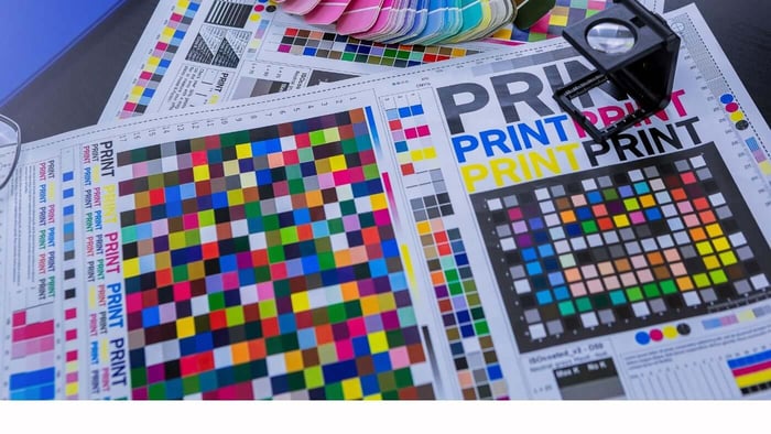
RGB, CMYK, and Color Gamut
RGB and CMYK are color systems. RGB is usually used for screens. CMYK stands for cyan, magenta, yellow, and black, and it is the traditional language of print.
The important word here is gamut. A color gamut is the range of colors a device or process can reproduce. Many screens can show very bright colors that are outside the range of standard print inks. Those colors are called out of gamut.
When a color is out of gamut, the printing process has to bring it back into a printable range. That conversion can make sticker colors look less saturated, especially in the brightest parts of a design.
In many sticker printing workflows, RGB artwork is preferred because RGB files can preserve more color information before production conversion. That gives the print process more data to work with than a file that has already been converted poorly.
That said, RGB is not magic. If a color cannot be reproduced with ink and material, the printed version still has to land somewhere realistic.
Your Screen Is Not a True Proof
A digital proof is useful for checking size, shape, cut line, layout, spelling, and general design placement. It is not a perfect color match.
Your screen settings affect what you see. A phone at full brightness can make sticker colors look more intense. Night Shift, True Tone, blue light filters, gaming monitors, cheap laptop screens, and uncalibrated displays can all change the appearance of the same file.
Two people can look at the same proof on two different screens and see different reds, blues, or skin tones. Neither screen is necessarily “right.” It is just interpreting the file through its own display settings.
That is why printed color should never be judged only from a phone screenshot. Use the proof to catch design issues. Use notes, references, and clear expectations to guide color.
Material and Laminate Affect the Final Look
Sticker material matters too.
White vinyl gives color a clean base. Clear stickers can look different because the background surface shows through. Holographic stickers shift with rainbow effects. Glitter stickers add sparkle under parts of the design. Matte laminate softens glare, while gloss laminate can make colors feel a little brighter and more reflective.
That means the same artwork may not produce identical sticker colors across every material and finish.
For example, a logo printed on white vinyl may look solid and bold. The same logo on clear vinyl may feel more subtle unless white ink is used behind parts of the design. The same artwork on holographic material may look more dramatic, but the rainbow material can change how certain colors appear.
This is why finish choice should match the artwork, not just the mood of the design.
Brand Colors Need Extra Care
Brand colors can be tricky because people often expect them to match exactly.
A hex code like #00AEEF may be useful for a website, but it does not guarantee the same printed result. Hex values are screen values. They describe digital color, not a physical ink result on laminated vinyl.
If you have strict brand requirements, include the color values you use, but also explain which colors matter most. A logo with one critical blue needs different attention than a busy illustration where general vibrancy matters more than exact matching.
Helpful notes include:
“Please keep the red as close to our brand red as possible.”
“The blue in the logo is more important than the background.”
“This should feel bright and warm, not muted.”
“Please avoid the green looking too yellow.”
“This should match a previous sticker order.”
Clear notes help the proofing and production process focus on the right detail. Without that context, it may not be obvious which sticker colors are most important.
How to Set Up Artwork for Better Sticker Colors
You do not need to be a print expert to get good results. A few setup habits help a lot, especially when sticker colors need to stay close to the original design.
Start with a high-resolution file. For raster artwork, 300 PPI at the final print size is a good target. Vector files like AI, EPS, SVG, and PDF are even better for logos, text, and clean shapes.
Avoid screenshots whenever possible. Screenshots are often low resolution and may already have color compression. They can work for showing a quick idea, but they are not ideal for finished sticker colors.
Use strong contrast. Thin light text on a bright background may look readable on a glowing screen but feel weak in print. If the sticker will be small, make the text thicker and the contrast stronger.
Be careful with neon-style colors. Very bright colors may still look good, but they may not print with the same glow you see online.
Keep a copy of the original file. If adjustments are needed, it is easier to work from the original than from a flattened or compressed export.
What Proofing Can and Cannot Tell You
Proofing is there to catch problems before printing.
A proof helps confirm the cut line, size, border, design placement, and any obvious file concerns. If the file has low resolution, strange borders, small text, or a layout problem, the proofing stage is the right time to fix it.
Proofs are also a good time to add color notes. If sticker colors need to lean warmer, cooler, brighter, darker, or closer to a previous order, that should be noted before approval.
The proof is not a guarantee that your screen is showing final printed color perfectly. It is still one of the best tools for making sure the design is set up correctly.
This is the moment to slow down and check the details. A small note before production is much easier than a correction after the stickers are made.
Common Reasons Sticker Colors Look Different
Here are the most common causes of color differences:
The design was viewed on a very bright screen.
The file used out-of-gamut RGB colors.
The artwork was low resolution or compressed.
The file had an unusual or missing color profile.
The sticker material changed the look of the ink.
A matte or gloss laminate affected the finish.
The design used thin lines or low contrast.
The buyer expected a perfect hex code match.
The proof was reviewed on a phone only.
The design was made from a screenshot.
None of these issues are rare. Most are easy to avoid once you know what to look for.
Why White Ink Matters on Clear and Specialty Stickers
White ink plays an important role in certain sticker types.
On white vinyl, the material itself provides a white base. That helps printed colors look solid and easy to read. On clear, holographic, glitter, or other specialty materials, that base may not exist unless white ink is added behind the design.
White ink can make sticker colors look more opaque. It can also help preserve contrast on clear stickers, especially when the sticker will be placed on glass, plastic, or a colored surface.
Without white ink, printed areas may look more transparent or may let the specialty material show through. Sometimes that is the goal. Sometimes it makes the design harder to read.
A simple rule works well:
Use white ink when the design needs solid color, strong contrast, or readability.
Skip or reduce white ink when you want the material effect to show through.
This is especially important for clear stickers, holographic stickers, and glitter stickers.
Why Printed Samples Can Help
For large orders, detailed brand projects, or products where color accuracy really matters, samples can be useful.
A printed sample shows how the design, material, laminate, and lighting interact in real life. It gives a better sense of final sticker colors than a screen proof alone.
Samples are especially useful when:
The order uses strict brand colors.
The design includes skin tones.
The artwork has subtle gradients.
The sticker will be used on product packaging.
The sticker will be placed on a colored surface.
The design uses specialty material.
The final order quantity is large.
A sample may add time to the process, but it can prevent bigger problems later. That tradeoff is usually worth it when the sticker is tied to packaging, retail products, events, or long-term brand use.
How Lighting Changes Printed Color
Printed stickers can look different depending on where they are viewed.
A sticker may look one way under warm indoor lighting and another way outside in daylight. Fluorescent lights, LED lights, sunlight, shade, and car interiors can all affect how sticker colors appear.
This matters because stickers are usually used in real environments, not under perfect studio lighting.
For example:
A sticker on a laptop may look different indoors than near a window.
A sticker on a water bottle may look brighter outside.
A sticker on a storefront may change throughout the day.
A sticker on packaging may look different under retail lighting.
A sticker on a car may look different in sun, shade, or cloudy weather.
This is normal. Printed color always depends partly on the light around it.
How to Get the Best Printed Result
The best approach is to think of the sticker as a physical product from the start.
Use a clean file. Make text readable. Keep important colors clear. Choose a material that supports the design. Add notes when specific sticker colors matter. Review the proof carefully.
And remember that print has its own strengths. A finished sticker has texture, surface, durability, and real-world presence. It can go on a laptop, bottle, car window, package, helmet, notebook, or storefront. It does not need to glow like a phone screen to look great.
Good printing is not about copying a monitor perfectly. It is about making the best physical version of the design.
Quick Checklist Before You Approve Your Proof
Before approving a sticker proof, check the design against this list:
Is the file high resolution?
Is the text large enough to read at the final size?
Are the most important sticker colors clearly noted?
Does the design rely on neon colors that may shift in print?
Is the contrast strong enough?
Is the material right for the artwork?
Does the sticker need white ink?
Is the cut line correct?
Are borders even?
Are spelling, dates, and website details correct?
Are you viewing the proof on more than one screen if color matters?
This checklist will not remove every possible color difference, but it will catch the most common issues before production.
FAQs
What are packaging stickers used for?
Packaging stickers are used to seal tissue paper, brand boxes, add thank-you messages, label products, organize variants, share care instructions, and include small customer freebies.
Are custom stickers good for small business packaging?
Yes. Custom stickers are useful for small business packaging because they can upgrade plain boxes, bags, mailers, and envelopes without requiring fully custom packaging.
What size should packaging stickers be?
A two-inch sticker is a good starting point for seals and inserts. Larger stickers work well for boxes and bags. Smaller stickers are better for product details, care notes, and variant labels.
Should I use stickers or labels for packaging?
Use stickers for branding, inserts, seals, and decorative packaging. Use labels when you need repeated product information, roll application, ingredients, care details, or structured product labeling.
Should I include free stickers in customer orders?
Free stickers can be a smart packaging insert if the design fits your audience. The best free stickers are useful, durable, and interesting enough for customers to keep.