
Stickers are tiny billboards. They get a split second to work—on a laptop lid, a water bottle, a box top at the point of sale. In that moment, color does the heavy lifting. Here’s how to use it with intent, blending practical print know‑how with the psychology behind what people actually notice and trust.
Warm vs. cool: how colors behave (and why that matters)
Warm hues (reds, oranges, yellows) tend to feel energetic and urgent. Cool hues (blues, greens, some purples) feel calmer and more reassuring. This isn’t mysticism; it shows up again and again in design practice and research linking color to emotion and perception. If you’re asking a sticker to be a “tap on the shoulder,” warmth often helps. If you’re asking for credibility—a warranty seal, a “quality guaranteed” label—cooler palettes usually earn more trust at a glance.
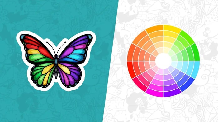
What you pair those colors with is just as important. Complementary pairs (across the color wheel—think teal and orange) create strong contrast that reads as lively and bold; analogous palettes (neighbors on the wheel—forest, moss, sage) feel more unified and quiet. Call the first “pop,” the second “subtle sell.” If you want a limited‑edition drop to jump off a shelf, a complementary accent can do it. If you want a premium brand mark to feel expensive, keep the palette tight and low‑contrast within a single temperature family.
A last nudge from psychology: red elements are more likely to grab attention in competitive visual fields, and blue light has links to alertness and performance—useful context when you’re deciding where that tiny callout or badge color should go. None of this overrides brand meaning, but it explains why some stickers get noticed faster.
If you’d like a quick refresher on terms and examples, this short primer on color theory is a handy skim before you start sketching.
Brand colors: keep the promise, make the move
Your brand palette is a promise. When you translate it onto a sticker, ask a simple question: what’s the job of this piece in three seconds at arm’s length? The answer determines how you use those colors.
If the job is recognition—think logo decal—let the primary brand color carry most of the surface and use neutrals (near‑black, off‑white) for type or marks. That gives you clean reproduction and keeps your logo feeling like itself in different environments. If the job is persuasion—“New flavor,” “20% off,” “Scan to follow”—bring a secondary accent to the front and let your core color play support. That doesn’t betray the brand; it creates hierarchy.
Mind the context. A deep navy that looks refined on your site can collapse into “almost black” when it’s a 1.5‑inch circle on a matte surface. If the sticker lives on silver equipment, account for that underlying metal tint; if it’s going on craft boxes, remember the warm brown will influence perceived hue. And yes, culture and category matter: a chili‑red badge means heat on a hot sauce, but “error” on a tech label. The rule of thumb is simple—let brand color lead, but let the sticker’s job and environment tune the volume.
Contrast in print: small stickers, big legibility
On screen, “good enough” contrast often passes. In print, tiny formats punish weak contrast. Think about luminance difference first (light vs. dark), then hue difference. Pale text on a bright background can look chic in Figma and turn to fog in your mailbox.
Two practical moves help. First, pick a type color that’s a clear step lighter or darker than the background—charcoal on pastel, ivory on navy. Second, avoid placing fine white type over saturated colors unless the background is very dark or you’re willing to thicken strokes. If you need the sticker to shout, use complementary contrast between background and accent elements; if you need it to whisper, tighten the palette and let texture or finish do the work.
Print mechanics shape contrast too. Gloss laminate boosts saturation and specular highlights, which can make brights look brighter but can also add glare under shop lights. Matte knocks down reflections, increases perceived sharpness of small type, and reads more “tactile.” And if you’re printing on clear or holographic stocks, plan a white underbase behind the color areas you want to stay true; otherwise, the substrate will bleed through and shift your hues. A production note from the field that saves reprints: define where you do—and don’t—want that white.
Finally, handle edges with care. Stickers look clean when color runs to the cut, but tha
t requires proper full bleed setup and a safe margin for important details. If your design has a hairline keyline, give it enough weight so a slight trim variance doesn’t make it look off‑center. (Printers aren’t sloppy; physics is just real.)
A simple workflow that saves you reprints
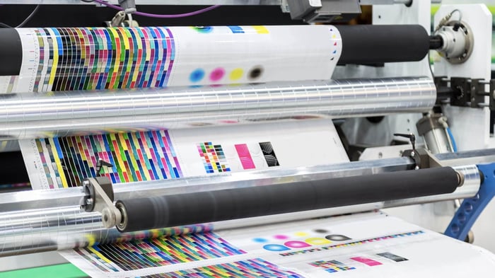
Start in the space where you think best—many designers sketch palettes and layouts in RGB because it feels expansive and fast. But always design with the print endpoint in mind. For process printing, CMYK is the standard color model; it describes ink on a substrate rather than emitted light on a screen. RGB can display colors your printer literally can’t reproduce, so plan for that conversion. Do your creative exploration, then soft‑proof CMYK and manage expectations before you sign off.
When building artwork files, use a consistent working space (sRGB/Adobe RGB for exploration; a CMYK profile appropriate to your print conditions for proofing). Keep brand swatches defined and named, avoid “mystery colors,” and preserve vector type where you can. If you rely on tiny text or delicate strokes, nudge color choices for real‑world contrast—not just what looks elegant on your monitor. Adobe’s guidance is straightforward here: edit in RGB while you’re iterating, proof for CMYK, and convert deliberately when you’re ready to print so you understand which brights will shift and by how much.
File prep is the unglamorous part that makes color choices pay off. Provide layered art to your vendor if they accept it, or high‑resolution PDF/PNG with transparent backgrounds when needed. Define cut paths clearly and include bleed where the art runs to the edge. If you’re using clear stock, specify that white ink underbase. And if you’re still deciding what “bleed” means in practice, that article above is worth ten minutes because it shows where designers most often lose a hairline of color at the edge and how to prevent it.
Putting it together
If you’re launching a new coffee roaster, a small 2‑inch seal on your bags might use warm cinnamon for the “Limited Roast” ribbon over a deep green field—complementary contrast for the announcement, brand‑true cool for the base. Matte laminate keeps the vibe grounded; ivory type on the green stays crisp. If you’re shipping a tech accessory, flip the script: cooler blues and graphite for trust, then a tight pop of orange for a “2‑year warranty” badge that guides the eye without hijacking the whole sticker. In both cases, your color choice does a job first and expresses flavor second.
Color is the most persuasive part of a sticker you can’t afford to explain. When it works, you won’t need to.
Custom Vinyl Stickers

$28.99
Description Vinyl Stickers | Quality Vinyl Stickers By default we will die cut your vinyl stickers to the shape of your design. However, please add a note at checkout or request proofs if you would like standard shapes such as circles or… read more