Table of Contents
CMYK vs RGB on press: what actually changes
Screens make color with light. Printers make color with ink. RGB is additive light. CMYK is subtractive ink. That alone explains a lot. A monitor can show neon-like colors your printer cannot reproduce. Those out-of-gamut colors get clipped or compressed into the nearest printable color during conversion.
Two other press factors matter. Paper an d dot behavior. Paper is never as white as your backlit display. Creamy or cool papers shift the whole image. Ink dots also grow on paper. That is called tone value increase, often shortened to dot gain. It darkens midtones and can make type or fine gradients fill in. When you understand these physical limits, you stop expecting a one-to-one screen match and start aiming for a predictable, good-looking print.
One more practical note. A lot of modern digital print engines accept RGB files and convert at the rip for the widest gamut they can hit. That can preserve punchy colors better than an early manual CMYK conversion. Ask your print shop which workflow they want.
Soft-proofing that works
You soft-proof to see the print on your calibrated monitor before you pay for it on paper. Here’s a clean way to do it in Photoshop.
Open your RGB master. Do not convert it yet.
Go to View > Proof Setup > Custom.
Choose the ICC profile for the target press or standard. Common profiles include GRACoL 2013 CRPC6 for coated stock in North America, or Fogra profiles in Europe.
Rendering intent. Start with Relative Colorimetric and turn on Black Point Compensation. If large areas are clipping or banding, try Perceptual and compare.
Turn on Simulate Paper Color when you need to see how an off‑white stock will lower contrast and shift white.
Toggle View > Proof Colors on and off. Fix trouble spots non‑destructively with adjustment layers. Keep your master in RGB.
You can also soft-proof a PDF in Acrobat using Output Preview and Convert Colors when you need to simulate or perform final conversions. That is handy for checking rich black, overprints, and spot color handling. If you live in Affinity apps, use a Soft Proof adjustment layer and hide it before export. The idea is the same.
What change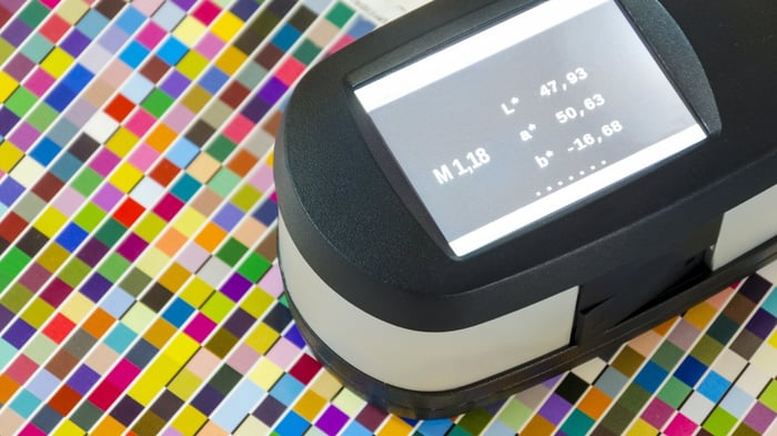 s on press that you can’t see on screen
Let’s list the big ones and what to do.
Color gamut
RGB can show colors that CMYK cannot print. Think electric greens, blues, and oranges. In soft-proof, those areas look duller. You can let the intent compress them, or manually tame saturation so the whole image feels balanced.
Tone value increase
Halftone dots grow on paper. Midtones print darker. If your soft-proof looks heavy in the 30 to 70 percent range, lift the curve slightly and recheck. Keep an eye on skin and midtone gradients.
Paper white and ink black
Real paper is not pure white. Real black ink is not OLED black. Simulate Paper Color and Simulate Black Ink so you are judging contrast in the same range your print will have. Expect the preview to look flatter. That is the point.
Total ink limit
You cannot stack infinite ink. Profiles enforce a maximum called TAC or TIC. If your file breaks that limit, drying and setoff problems follow. Use InDesign’s Separations Preview or Acrobat’s Output Preview to check hot spots. If needed, reduce saturation or change the separation strategy so heavy CMY builds get replaced with K.
When to adjust and when to leave it RGB
Here is the simple rule I use.
If your printer accepts RGB and uses an extended-gamut or multi‑ink device, leave the art in RGB, soft-proof to their profile, and export with the embedded RGB profile. You keep more of the punch and let their rip do the heavy lifting.
If your printer requires CMYK and gives you a target profile, soft-proof, fix issues while still in RGB, then convert to that CMYK at the end. Re‑check after conversion and make small tone moves if needed.
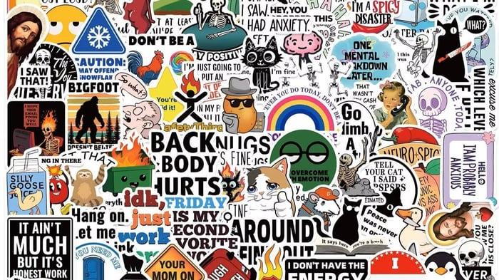
If you are mixing processes, say vinyl stickers plus a newspaper insert, make separate outputs for each printing condition. One size does not fit all.
For a deeper background on how device choice affects gamut, their team explains why they often prefer RGB source files in this post: The Importance of Color Theory in Graphic Design. It is also worth skimming their plain‑English primer on rips and why a good rip makes color more predictable: What is RIP software? A Simple Guide.
Soft-proof settings you can trust
Rendering intents control how out‑of‑gamut colors get mapped.
Relative Colorimetric tries to keep in‑gamut colors exact and clips the rest to the nearest printable color. It is great when most of your image is in gamut and you care about neutrals staying neutral.
Perceptual moves more colors to keep relationships intact. It helps when you have large blocks of saturated color and the Relative preview bands or looks harsh. Try both. Choose by eye for the job.
Leave Black Point Compensation on in most cases. It helps preserve shadow detail when the print cannot hit the same deep black you see on screen. You stickers also follows this method.
Rich black, overprint, and ink limits without headaches
Use plain 100 K for small black text so registration stays tight. Use a rich black build for large black fills. The exact recipe depends on your press and paper because you must respect TAC. Many shops running GRACoL profiles also cap at around 320 percent on coated stock. A common rich black in that range is 60 C, 40 M, 40 Y, 100 K. Do not guess. Ask your printer or check their spec page. Then preview ink coverage in Acrobat or InDesign before you export.
While you are there, check overprints. Black vector text often overprints by default. That is good. Big colored objects generally should not overprint unless you are doing it on purpose.
A 10 minute soft-proof checklist
Calibrate your monitor and set a sane brightness.
Open the RGB master.
Proof Setup to the printer’s ICC.
Relative Colorimetric plus Black Point Compensation.
Toggle Simulate Paper Color if your stock is warm or matte.
Fix clipped brights and heavy midtones with adjustment layers.
If CMYK is required, Convert to Profile as a last step.
Check Total Ink and overprint in Acrobat or InDesign.
Export a PDF with embedded profiles.
If time allows, order a proof before you run the full job.
Quick FAQs
Do I have to design in CMYK for print
Not always. If your shop accepts RGB and targets a wide‑gamut device, RGB source files plus soft‑proofing are often safest. If they require CMYK, proof and convert at the end.
Why did my neon green die in print
It was out of gamut for CMYK on your stock. Use soft‑proof to see it in advance and reduce saturation or pick a spot color if the brand demands it.
How do I avoid muddy black
Use a printer‑approved rich black build for big areas, use 100 K for small text, and respect the total ink limit.
Final thought
Color is physics and math, not magic. CMYK vs RGB is just a choice about where and when the conversion happens. When you soft‑proof to the right profile, check ink limits, and only convert at the end, you will get stickers that look the way you meant them to look.

