Table of Contents
- Why QR code stickers work so well
- The non-negotiables: size, distance, and the 10:1 rule
- Keep it readable: high contrast and clean color choices
- The quiet zone: give your code breathing room
- File prep that prevents scanning failures
- Error correction and data choices
- Material, finish, and placement tips
- Sizing examples you can copy
- Proofing and testing checklist
- Common mistakes to avoid
- Quick ordering notes
- Conclusion
- References
QR code stickers sound easy until one won’t scan. I’ve been there, waving a phone over a label like I’m casting a spell. This guide fixes that. We’ll cover how to size QR code stickers for real distances, what contrast actually works, why the quiet zone matters, and how to prep files so your codes scan on the first try. If you just need the short version: keep QR code stickers high-contrast, give them clean space, and test a proof in the lighting they’ll live in.
Why QR code stickers work so well
Stickers go where people are. Add a code and you turn packaging, windows, handouts, and gear into fast links to menus, payments, signups, or reviews. And because you can print them on vinyl or BOPP with laminate, they survive rain, oils, and the dishwasher. That combo is why QR code stickers still outperform “type this URL” in the wild.
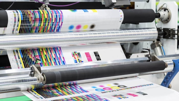
For quick context on color and print behavior, this post on practical color management is worth a skim: CMYK vs RGB in Simple Terms. It shows what actually changes on press, which helps when your code needs solid, sharp edges.
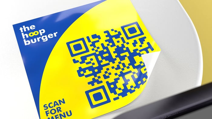
The non-negotiables: size, distance, and the 10:1 rule
If people scan from a few inches away, small codes are fine. If they scan from across a counter or a hallway, size up. A simple rule many teams use is the “10 to 1” guideline: plan for roughly one unit of code size for every ten units of viewing distance. If the phone will be 20 inches away, a code around 2 inches wide is a safe starting point. For hand-held menus and labels, aim for 0.8 to 1.0 inches minimum, then test. Larger is always easier to scan.
Keep it readable: high contrast and clean color choices
Dark code on a light background works best. Phones are forgiving, but low contrast causes failures fast, especially indoors. Skip glossy gradients inside the modules, avoid light-on-dark reversals, and don’t overprint textures under the code. If you brand the background, keep it subtle and uniform behind the code.
The quiet zone: give your code breathing room
Every QR needs a clean blank border around the symbol. This is called the quiet zone. Make that border at least four modules wide on all sides. If your code is 33 by 33 modules, add four modules of space on each edge before any art, pattern, or trim. No logos, borders, or text in that space. This single rule prevents a lot of “it scans for me but not for customers” headaches.
File prep that prevents scanning failures
Use vector formats when you can. SVG, EPS, or a high-resolution PDF keeps module edges crisp when we scale for different sizes. If you must supply a raster file, export at 600 dpi or higher at final print size. Avoid re-saving compressed PNGs over and over, and never stretch a low-res QR to make it bigger. Sharp corners matter.
If you are designing a full label with a QR code, this quick walkthrough is handy for laying out text and safety margins before you export: How to Create Custom Water Bottle Labels (the simple way).
Error correction and data choices
Shorter data = fewer modules = easier scans. Links with UTM tags, huge vCards, or long Wi-Fi payloads make the grid dense. Use a short URL or a dynamic code if you need flexibility. For print, error correction at medium or high is usually a good tradeoff. You get resilience if the code gets scuffed without making it so dense that small prints fail.
Material, finish, and placement tips
Material
Vinyl stickers with a laminate hold up outdoors, on bottles, and on cars. BOPP label stock works well for product packaging and curved surfaces because it’s thin and flexible. Both take crisp type and tight QR edges when printed correctly.
Finish
Matte cuts glare under overhead lights and sunlight. Gloss can look great but may reflect in photos and at weird angles. If your sticker will be scanned under bright retail lights, matte often wins.
Placement
Eye level is best for signage. For packaging, place the code where fingers don’t crease it and where cameras can approach square to the surface. Keep the code flat across seams or curves, and avoid small codes on tight radiuses.
Sizing examples you can copy
Use these as starting points, then test with your phone at the actual distance.
Handheld labels or inserts: 1.0 to 1.25 inches code size
Bottles and jars at arm’s length: 1.25 to 1.75 inches
Table tents and counters: 1.5 to 2.0 inches
Windows people scan from outside: 3 to 6 inches, depending on distance
Remember to add the quiet zone to those sizes and keep background art out of it.
Proofing and testing checklist
Print one at actual size on a home or office printer
Test with two different phones and camera apps
Test in the lighting you expect, including glare
Scan from the real distance, not just up close
Wipe the surface if it’s glossy or oily and scan again
If you add a logo inside the code, re-test at minimum size
If anything feels finicky, increase the code size and simplify the background.
Common mistakes to avoid
Placing text or a border inside the quiet zone
Using low contrast colors or printing the code over patterns
Exporting a tiny PNG and scaling it up in layout
Shrinking the code to make room for more copy instead of moving elements
Making the call to action too vague
Assuming it scans just because it scanned once on your phone
Quick ordering notes
Already have a working layout with a clean quiet zone and a vector QR? You’re in good shape. Upload the design, pick your size and quantity, and request a proof. If you need help with bleed, cutline, or a small layout tweak, include a note and ask for a proof with dimensions called out around the code. That makes final checks fast.
Conclusion
Good QR code stickers are simple: readable size for the distance, strong contrast, a proper quiet zone, and sharp files. Do one test print before you buy a stack, fix what fails, then go to press. You’ll save time, and your customers will actually scan.
References
DENSO WAVE. “Point for determining the code area” — quiet zone requirement of four modules on all sides. qrcode.com
NN/g. “13 QR-Code Usability Guidelines” — minimum practical size guidance. Nielsen Norman Group
QR Code Generator. “Minimum QR Code Size” — 0.8 in close-range baseline.
Uniqode. “QR Code Printing Guidelines 2025” — vector formats and proofing best practices. Uniqode