Table of Contents
- TLDR
- Why Color Matching Matters For Stickers
- What A Color Matching Tool Online Actually Does
- Best Online Color Matching Tools For Sticker Artwork
- How To Use A Color Matching Tool Online For Sticker Design
- RGB, CMYK And Why Your Screen Is Not The Final Sticker
- Matching Colors For Different Sticker Types
- Common Color Matching Mistakes
- A Simple Color Matching Workflow Before You Order
- Final Thoughts
- FAQs
TLDR
A color matching tool online can help you pull colors from a photo, find hex codes, build a brand palette or compare color options before printing stickers.
Use tools like Coolors, Canva, Paletton and Figma for sticker design palettes. Use paint tools like Sherwin-Williams ColorSnap, Benjamin Moore Color Portfolio and Resene ColourMatch for room and product inspiration. For printed stickers, remember that screen color is only a starting point. Material, finish, file setup and proofing all affect the final result.
For color-sensitive sticker artwork, start with clean digital color codes, use strong contrast and upload high-resolution artwork to CustomStickers.com so your design can be reviewed before printing.
Why Color Matching Matters For Stickers
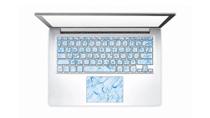
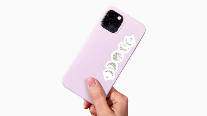
A color can look right on your laptop and then feel slightly off when it becomes a sticker. That is normal. Screens glow. Stickers reflect light. A blue that looks rich in Canva may print a little softer on matte vinyl. A neon green from a photo may be outside the range of what most printers can reproduce exactly. And a transparent sticker can look different depending on the bottle, window or laptop it is applied to.
That is why a color matching tool online is useful, but it should not be treated like a magic final answer. It helps you choose a direction. It helps you identify color codes. It helps you build a cleaner palette. Then the print process, material and finish bring that design into the real world.
For sticker design, the goal is not just to “match a color.” The goal is to make the color work on the actual sticker. That means the design should stay readable, look good at the finished size and fit the material you choose. If you are ordering custom vinyl stickers, color matching is part of a bigger design setup process.
What A Color Matching Tool Online Actually Does
A color matching tool online usually does one of four things.
It can pull colors from an image. You upload a photo, logo or screenshot, then click a spot to extract a hex code, RGB value or palette.
It can build a palette from a starting color. You enter one color and the tool suggests complementary, analogous, triadic or monochrome color combinations.
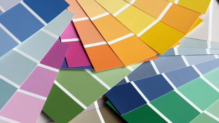
It can match a real-world color to a brand library. Paint tools like Sherwin-Williams ColorSnap, Benjamin Moore Color Portfolio and Resene ColourMatch are built for matching photos or surfaces to paint collections.
It can help test color harmony. Tools like Canva Color Wheel and Paletton are useful when you know your main color but need supporting colors that do not fight each other.
For stickers, the first two uses matter most. You usually need to extract a color from existing artwork or build a small palette that prints cleanly. Paint matching tools can be helpful for inspiration, especially if you are designing packaging, home décor stickers or product labels, but they are not always the best final reference for sticker print color.
Best Online Color Matching Tools For Sticker Artwork
Different color tools solve different problems. Here is the practical split.
| Tool Type | Best For | Good Examples | Sticker Design Use |
|---|---|---|---|
| Image color picker | Pulling colors from a photo or logo | Coolors Image Picker, Figma eyedropper | Great for matching an existing design direction |
| Palette generator | Building a color scheme | Coolors, Canva, Paletton | Great for sticker sets and brand palettes |
| Design editor color tools | Applying colors inside artwork | Figma, Canva | Useful for preparing artwork before upload |
| Paint color matcher | Matching décor, walls or physical inspiration | Resene, Sherwin-Williams, Benjamin Moore | Good for inspiration, not always final sticker color |
| Industrial color software | Manufacturing and formula matching | OnColor Match | Usually more than a sticker customer needs |
| Personal color analysis tools | Wardrobe and seasonal color matching | True Colour Match | Useful for clothing decisions, not primary for stickers |
Coolors is one of the easiest tools for quick palette generation. It is useful if you want several sticker colors that feel related, like a set of product labels, laptop stickers or planner stickers.
Canva Color Wheel is helpful if you want to understand why colors work together. It is simple enough for beginners and useful for building complementary or triadic palettes.
Paletton is good for people who want more control over color relationships. It has a classic color-wheel feel and works well when you already have one main color.
Figma is useful if you are already working in a design file. Its eyedropper lets you sample colors from images, design layers or backgrounds, then apply those colors directly to your artwork.
Resene ColourMatch, Sherwin-Williams ColorSnap and Benjamin Moore Color Portfolio are better for paint and interior color matching. They are useful when you want your sticker, label or packaging to coordinate with a room, wall color or product environment.
Williamsburg and GOLDEN-style paint mixers are more useful for artists working with physical paint. They can be interesting if your sticker artwork starts as traditional art, but most sticker files still need clean digital artwork before printing.
How To Use A Color Matching Tool Online For Sticker Design
Start with the best version of your source image. If you are matching a logo, use the original logo file, not a screenshot from social media. Screenshots often compress colors. Photos can pick up shadows, glare and camera color shifts.
Upload the image to a color picker like Coolors or place it into a design tool like Figma. Click the area you want to match. If the image has shadows or texture, sample a few nearby spots. Do not trust one click on a noisy photo.
Write down the hex code and RGB values. Keep those with your design notes. If you are building a brand sticker, this helps keep your colors consistent across future orders.
Next, build a small palette. Most sticker designs do not need eight competing colors. A clean setup might use:
One main brand color
One dark color for text or outlines
One light color for contrast
One accent color
White space or transparent space, depending on the sticker type
Then check contrast. A sticker is often viewed from a few feet away. Tiny low-contrast text may look fine on a bright monitor but disappear on the finished sticker. This matters for sticker sheets, product labels and small logo stickers.
Finally, upload the best artwork file you have. CustomStickers.com can work with common file types, but clean artwork helps the final sticker. High-resolution PNG, JPG, SVG, AI, EPS or PDF files are usually better than small screenshots.
RGB, CMYK And Why Your Screen Is Not The Final Sticker
Most online color matching tools use digital color values like hex and RGB. That makes sense because they live on screens. Sticker printing is different. A printed sticker has ink, vinyl, laminate and lighting conditions.
At CustomStickers.com, artwork can be supplied in RGB or CMYK, but RGB is typically recommended because it has a broader color range for the company’s print setup. That is a little different from the old advice that every print file must be CMYK before upload. Modern print workflows can handle RGB well when the printer has the right process.
Still, RGB is not a promise that every screen color can print exactly. Some bright digital colors are simply easier for a screen than for ink. Very intense blues, greens and neon colors may need adjustment. This is where proofing helps.
A good rule: use online color tools to choose and organize colors, then use the proof process to catch obvious setup issues before printing.
For a deeper explanation, the CustomStickers.com guide to CMYK vs RGB for sticker printing is a useful next read.
Matching Colors For Different Sticker Types
Color matching changes slightly depending on the sticker product.
For white vinyl stickers, colors usually look the most predictable. White vinyl gives the ink a bright base, which helps logos, illustrations and text stay clear. This is the safest choice for most brand stickers, laptop stickers, water bottle stickers and event handouts.
For clear stickers, the surface behind the sticker becomes part of the design. A color that looks great on a white screen may look different on glass, metal, a dark bottle or a colored product. If color accuracy matters, think carefully about where the clear sticker will be applied.
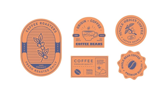
For sticker rolls and product labels, consistency matters more because the sticker may sit beside packaging, boxes, bags or other brand materials. Keep a simple palette and avoid sampling colors from random photos unless they are part of the brand system.
For sticker sheets, color harmony matters because multiple designs appear together. Use a palette generator before laying out the sheet. This keeps the sticker sheet from feeling scattered.
For art stickers, the goal may be less about exact brand matching and more about preserving the feel of the original artwork. In that case, upload the highest-quality artwork you have and avoid heavy filters that may shift the color.
Custom Vinyl Stickers

$42.00
Description Vinyl Stickers | Quality Vinyl Stickers By default we will die cut your vinyl stickers to the shape of your design. However, please add a note at checkout or request proofs if you would like standard shapes such as circles or… read more
Common Color Matching Mistakes
The biggest mistake is matching from a bad photo. A photo taken under warm kitchen light can make white look cream, blue look dull and red look orange. If you use that photo as your color source, the extracted color may be wrong before you even start designing.
Another mistake is using too many colors. More colors do not always make a sticker better. A small sticker needs clarity. A simple palette usually prints cleaner and reads faster.
Low contrast is another common issue. Light gray text on a pastel background may look refined on a screen, but it can be hard to read on a 2-inch sticker. Use stronger contrast for small text, outlines and QR codes.
Some people also confuse paint matching with print matching. A Resene, Sherwin-Williams or Benjamin Moore result can help you find a paint color, but that paint name is not the same as a sticker print specification. Use paint tools for inspiration. Use digital artwork and proofing for sticker production.
And finally, do not assume matte and gloss will feel identical. Gloss can make colors look a little richer and more reflective. Matte can reduce glare and create a softer look. Neither is wrong. Choose the finish that fits the design.
A Simple Color Matching Workflow Before You Order
Here is a practical workflow that works for most sticker projects.
Choose your source color. This might come from a logo, brand guide, product photo, artwork scan or inspiration image.
Use a color matching tool online to pull the main hex or RGB value. If the source image has texture, sample a few spots and choose the cleanest representative color.
Build a supporting palette. Use Coolors, Canva or Paletton to find accent colors that support the main color.
Test the design at actual sticker size. Zoom out or print a basic paper draft at the size you plan to order. If the words are hard to read, the sticker needs more contrast or simpler artwork.
Choose the right sticker format. Use custom vinyl stickers for most standalone designs, sticker sheets for multiple designs and sticker rolls for product labels or packaging.
Upload the artwork and review the proof. The proof is not only about the cutline. It is also a chance to catch layout issues, small text, missing borders and other production concerns before printing starts.
Final Thoughts
An online color matching tool can make sticker design much easier. It gives you a starting point, helps you pull colors from images and makes your palette feel more intentional.
But the best results come from combining digital tools with practical print thinking. Use clean artwork. Keep contrast strong. Choose the right material. Think about matte versus gloss. And remember that the final sticker lives in the real world, not on a glowing screen.
If you are ready to turn your matched colors into a finished sticker, start with CustomStickers.com custom vinyl stickers. For multi-design sets, use custom sticker sheets. For packaging and product labels, sticker rolls are usually the better fit.
Good color starts with a tool. Great sticker color comes from the full process.
FAQs
What Is The Best Color Matching Tool Online For Stickers?
For sticker design, Coolors, Canva Color Wheel, Paletton and Figma are usually the most useful. Coolors and Canva are good for palettes. Figma is helpful when you are already editing artwork and need to sample colors directly.
Can I Match A Sticker Color From A Photo?
Yes, but use the best photo possible. Avoid photos with harsh shadows, glare or warm indoor lighting. A color picker can only sample the color that appears in the photo, not the true color of the physical object.
Are Hex Codes Enough For Sticker Printing?
Hex codes are helpful for design setup, but they are not a complete print guarantee. Sticker color also depends on the file, material, laminate, printer setup and lighting where the sticker is viewed.
Should I Use RGB Or CMYK For CustomStickers.com?
CustomStickers.com typically recommends RGB for its print setup because RGB has a broader color range. CMYK files can also be supplied, but RGB is often the better starting point for vivid sticker artwork.
Will My Sticker Match My Screen Exactly?
Not always. Screens and printed stickers show color differently. Use online color matching tools for planning, then review your proof and choose the right sticker material and finish.
What Finish Is Better For Accurate Sticker Color, Matte Or Gloss?
Gloss often makes colors look a little brighter and more reflective. Matte reduces glare and gives a softer finish. The better option depends on the design, where the sticker will be used and the look you want.