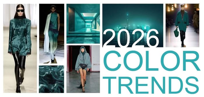

Designers want practical signals, not hype. So I pulled from runway reports, paint forecasts, and pro color institutes to map the color trends for 2026 you can trust.
The short version: teal leads (YAY!), browns get richer, pastels cool down, and pink grows up. If you work in branding, packaging, or stickers, these shifts affect contrast, print choices, and finish. I will keep this plain, tactical, and honest. You will see the phrase color trends for 2026 a few times because that is what you came for.
The big picture shaping 2026 color
Two forces shape the 2026 palette. First, a calm but not boring base. Think grounded neutrals and botanical influences for everyday use. Second, expressive accents that feel clean, cool, or slightly moody. The result is a flexible toolbox. You can go quiet and warm for brand trust or add a single cold note for a modern edge. Fashion runways are pushing icy tones and dusty pastels. Paint companies are leaning into garden-inspired warmth. Trend forecasters keep teal at the center. All three align more than you might expect.
Headliner hue: teal carries the year
Teal is the anchor. It is the rare color that reads natural and tech at once. In 2026, teal trends a bit darker and more fluid. Pair it with cream, soft brown, or warm gray for corporate and packaging. Or set it next to a vapor-cool blue for tech and editorial. Teal also survives real world printing. It holds saturation in CMYK, and it does not die on uncoated stock as fast as some greens do. If you want a simple palette update for next year, add a deep teal and remove an old navy. Same job, fresher read.
Use it like this
Brand primary: deep teal
Supporting: milk white, clay, walnut
Accent: electric cyan for UI, amber for packaging
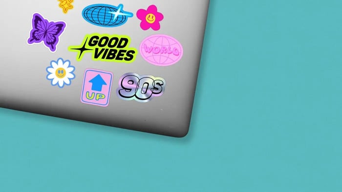
Sticker tip
Teal on clear vinyl with a white underbase looks sharp. If you go matte, it reads modern. If you go gloss, it reads sporty.
Neutrals get warmer and browner
Neutrals in 2026 tilt warm: cream, butter yellow whispers, almond, clay, tobacco. The point is comfort without beige fatigue. These tones give you a soft light source under color accents. They make fuchsia feel adult, and they make teal feel grounded. For brand systems, swap a cool gray background for a warm parchment or light taupe. Your photos will look better. Your UI will feel less sterile. On physical goods, warm neutrals hide scuffs and finger oils better than cold grays.
When to pick matte vs gloss
Warm neutrals shine in matte. Gloss can feel plastic here. Save gloss for accents, spot UV, or holographic elements.
Pink grows up: from baby to “faded petal”
Pink is not leaving. It is just getting dustier. Call it blush, shell, antique rose, or faded petal. This is not bubblegum. It pairs well with moss green, plum, and buttery yellow. In packaging, dusty pink with brown type feels premium without leaning luxury-cold. In UI, it can replace gray in empty states without killing contrast.
Sticker tip
Dusty pink line art over cream works well on matte BOPP. Keep type in dark brown or charcoal for contrast.
Cool shift: icy tones and dusty pastels
Runways point to icy blues, lavender blues, and sun-baked pastels. That sounds like a contradiction, but the mix is the trend. Think pale blue headlines over warm paper, or a dusty mint accent on a tan background. This is where modern comes from in 2026. If your brand leans young or digital, mix one icy note into a warm system. Keep it small. You only need a button, a border, or a callout.
Accessible color check
Icy tones can fail contrast fast. Always test your text colors. If you need a quick refresher on harmonies and building balanced palettes from one hex, see our guide: How to Calculate Complementary, Triadic, and Tetradic Colors from a Hex Code. CustomStickers.com
Expressive accents: fuchsia, amber, and jelly mint
The accent story is clear: one bright at a time. Electric fuchsia, clear cyan, mineral blue, amber haze, and a minty green all show up in 2026 conversations. The common trait is clarity. These accents are saturated but not muddy. They look good against warm grounds. If you need a quick rebrand vibe shift, replace your old red with a cleaner fuchsia or your cold green with mint. Use them as highlights, not wallpaper.
Where accents work hardest
Call to action buttons
Foil or spot color on packaging
Die cut sticker outlines or inside strokes
Browns and blues: th e dependable pair
Rich browns return as the new black. Chocolate, leather, and apple-cinnamon tones make type friendlier than pure black. Pair with teal or powder blue for a grown-up palette that still reads modern. In print, brown inks cover well and look great on kraft stock. If you ship goods or run a coffee, bakery, or craft brand, this pair is your everyday workhorse.
Sticker tip
Brown line art on cream with a powder blue accent border looks premium and is easy to read from 6 feet.
Pattern, texture, and finish: color is not alone
Color trends for 2026 make more sense when you add finish. Warm neutrals plus soft-touch laminate feel right in hand. Icy accents plus gloss pop. Brown type plus kraft texture sells craft without shouting. If you want a deep finish dive, see our explainer on bleed and edge control for clean color blocks: What is Full Bleed Printing? Stickers and Beyond. CustomStickers.com
Finish quick picks
Matte laminate for warm palettes
Gloss laminate for icy accents and teals
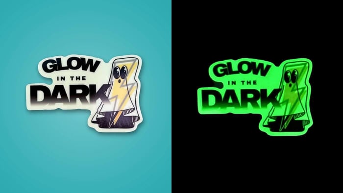
Holographic film for one accent element only
Clear vinyl with white underbase for color purity
Practical palettes you can lift today
Teal + Warm Neutral
Deep teal primary
Milk white background
Clay secondary
Amber micro accent
Grown-up Pink
Faded rose primary
Moss green secondary
Butter cream base
Dark cocoa type
Icy Minimal
Powder blue accent
Off-white base
Charcoal type
Walnut control elements
Cafe Modern
Leather brown primary
Cream base
Teal secondary
Soft gold foil accent
Use these as starting points. Adjust saturation and lightness to fit your brand. Keep the accent count to one.
Print production notes that save you pain
Convert early. Build master swatches in CMYK for print work. Only shift to RGB for web previews.
Watch small text. Icy pastels bleed out in 6 pt type. Use brown or charcoal for small copy.
Protect edges. If your design uses large color fields to the edge, plan for bleed and safe margins. Full bleed needs good prep and a clean cut path.
Spec your white. On clear stickers, always call white underbase areas so color stays true.
Proof smart. Soft proofs can lie on warm neutrals. Ask for a quick hard proof if the exact cream matters.
Where to test and order
You can mock up and order on our site at CustomStickers.com. If you want to compare vendors for a special run, you can also price at printiverse.com and youstickers.com. Use one design and shift the palette to see how each finish reads before you commit. PrintiverseYouStickers
Final take
The real color trends for 2026 are practical. Teal gives you a strong center. Browns and creams add warmth and trust. Icy notes and dusty pastels add freshness. Pink matures. Pick one accent, keep your neutrals warm, and match finish to mood. That is enough to make your work feel current without rebuilding your brand from scratch.