
Why retro aesthetics sell right now
Nostalgia converts. People feel closer to a time, a place, or a group, and that warm feeling makes small purchases—like a sticker at checkout—feel easy. What “retro” means, though, depends on the decade someone’s carrying around in their head. The 80s shout in neon and geometry. The 90s swing between gritty photocopy grunge and rave-poster color. Y2K looks like liquid chrome, jelly buttons, and glassy gradients. Those cues show up in fashion and on social feeds every week, so your design language doesn’t need a long explanation. It just has to trigger the right memory fast.
If you want stickers that actually move, design for two buyers at once: the person who lived it and the person who discovered it last week. The first wants accuracy; the second wants a look that hits instantly on a water bottle or laptop. Aim for both and you’ll notice the booth conversations (and the online conversion rate) get easier.
Decade cheat sheet: 80s, 90s, Y2K—what actually reads
80s works when you lean into Memphis shapes, arcade vibes, and high-contrast pattern fills. Think zigzags, checkers, hot pink, electric cyan, and lemon yellow—loud combinations with unapologetic black-and-white accents. Type should feel chunky and confident; outlines and block shadows help. The only real mistake is playing it safe. If it looks timid, it won’t read as 80s from five feet away.
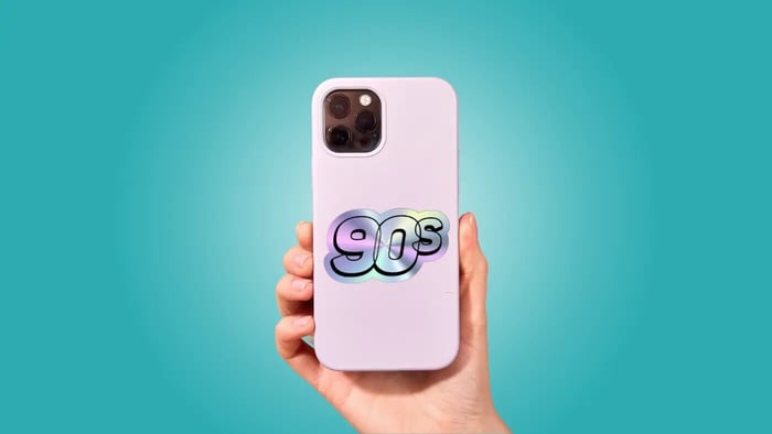
90s splits into a few lanes that still play nicely together. Grunge wants texture—photocopy grit, halftones, scuffed edges, a little misregistration. Rave wants acid neons, smiley faces, stretched display type, and gradients that feel like a flyer taped to a street pole at 2 a.m. Skate graphics, flame decals, and sticker-bomb compositions also live here. Mixing grime and candy polish can work, but give the mashup a reason (e.g., “garage band meets laser tag”). Otherwise, pick a lane.
Y2K is the era of tech optimism: glossy UI buttons, wireframes, pixel icons, jelly surfaces, and chrome that looks like you could touch it. Gradients are part of the grammar. Rounded techno type and tiny bitmap sublabels sell the look, and a single bevel or lens flare (used sparingly) can do more than a whole page of effects. The common failure is over-chroming everything so the eye has nowhere to rest. Pair reflective elements with flat color or simple linework so the shiny parts get to shine.
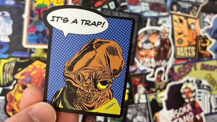
Across all three, keep IP out of it. People buy the feeling of a memory, not a traced logo.
Materials, finishes, and formats that help you sell
Design is half; the physical finish is the other half. Holographic film is Y2K’s best friend because the rainbow shift fakes pearlescent plastics and chrome without rendering everything in 3D. It loves bold keylines, solid fills, and negative space that lets diffraction show through. If your art already leans on smooth gradients, test a flatter version on holo—often better.
For 80s and 90s sets, standard vinyl is your workhorse. Gloss boosts arcade and rave palettes; matte flatters grunge textures and photocopy artifacts. Clear vinyl is great for “floating” UI bits: windows, cursors, loading bars, speech bubbles. Back with white where you need opacity and let everything else blend into the surface.
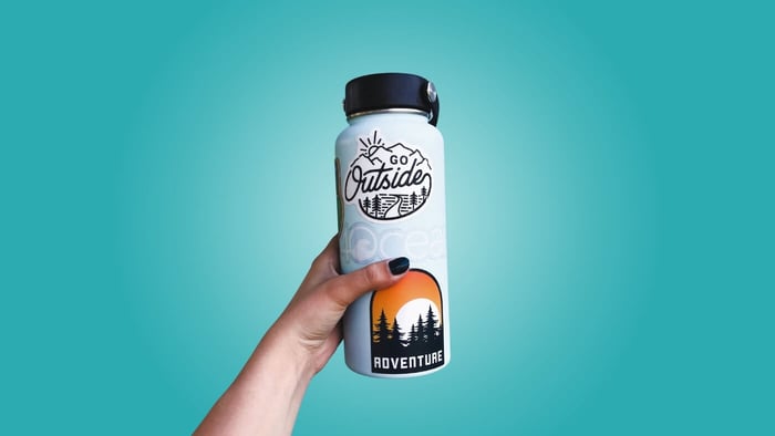
Holographic material taps the school-supply side of the 90s and late-90s sparkle. Die-cuts feel premium for characters and wordmarks, while kiss-cut sheets are perfect for micro-sets—three or four small pieces that tell one story and raise average order value. Durability matters too. A UV-laminated vinyl keeps color loud on water bottles and laptops and turns your customers into walking billboards.
(If you want to test how your palette translates, order a small run of holographic or standard stickers and compare them in daylight. Your eyes will tell you which one wins.)
Design moves that make retro packs work
Start with one short story. “Night at the arcade.” “Mall food court.” “Dial-up starter pack.” A clear concept keeps a set coherent and makes it easy to bundle. Build an era-correct palette next: neon on black with bold patterns for the 80s; either desaturated grit or unapologetic neon for the 90s; icy blue-to-purple gradients and metallic notes for Y2K. Color does more era-signaling in one second than any caption ever will.
Typography carries the decade, so choose with intent. Blocky sans and geometric infills scream 80s. Condensed grotesks, stretched display faces, and “photocopied” serifs read as 90s. Rounded techno, micro bitmap, and beveled 3D sell Y2K. You don’t need every trick at once. One signature move per design is enough.
Line weight also changes the read. Thick outlines feel 90s character-decal; hairlines with big glow effects feel Y2K; outline-free geometry with high contrast fills leans 80s. Keep stroke logic consistent across a set and you’ll have cohesion even when colors vary.
Design for distance and for the phone. Most decisions happen on screens or at arm’s length. Zoom your art down to 1.5–2 inches while working. If the face, icon, or wordmark doesn’t read, simplify. It’s painful to cut a beloved detail, but clarity beats clever when the canvas is tiny.
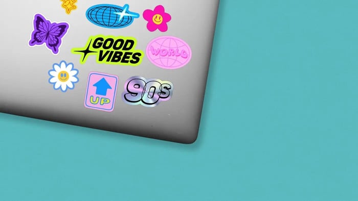
Bundles are where things click. Create a “hero” sticker that does the heavy lifting (a chrome wordmark, a character, a bold geometric cluster), then add two smaller “support” stickers that carry the motifs (a pixel cursor, a loading bar, a Memphis squiggle). Price the trio just under the cost of three singles and you’ll see it move. Name your packs like playlists—“Soft Grunge Locker,” “Laser Tag Friday,” “Food Court Summer.” A specific name makes the memory feel specific, which is the whole point.
Finally, let the finish do some work for you. Holo can replace lengthy gradient builds. Matte can deepen texture. Clear can deliver that floating window effect without extra outlines. When finish and art are on the same team, the sticker feels intentional instead of busy.
Why people keep buying: the small-scale psychology
People don’t only buy stickers because they “need” them. They buy because a design makes them feel connected—to friends, to a time, to who they were (or who they wanted to be). Retro cues are efficient shortcuts to that feeling. If your 80s shapes hit hard, your 90s textures feel lived-in, and your Y2K shine lands where it should, the brain does the rest. And when the physical product matches the memory you’ve teased—crisp print, clean cut, durable finish—customers come back for more because the feeling lasts.
That’s the whole play: familiar language, fresh delivery. The buyer gets recognition without boredom. You get designs that don’t stall after one weekend market.
A few quick hitters to keep (short and useful)
Start with a one-line story, then build everything around it.
Pick a single signature move per design (a type treatment, a finish, a texture).
Design at 2″ first; details that survive small will sing big.
Make a hero + two supports and price them as a mini pack.
Test two finishes in daylight before committing.
When you’re ready to print, a small test run beats guesswork. Order two finishes, lay them side by side, and pick the one that gets a quicker grin from a friend. If it makes them smile before they’ve read a word, you’re on track.